Native Android Development Tutorial (Kotlin and Jetpack Compose) - Part 1
In the React Native and Flutter tutorials we built a Notes app with cross-platform frameworks. In this tutorial we build the same app natively for Android, with Kotlin and Jetpack Compose, Google’s modern toolkit for native UI. The goal is to compare the two approaches: what do you gain, and what do you pay, when you target one platform with its own tools?
The tutorial follows the same three parts as the previous one:
- Part 1 (this file): fundamentals and a local Notes app
- Part 2: connecting the app to a database (Appwrite)
- Part 3: authentication, per-user data and publishing
Versions used in this tutorial. If something breaks, come back to this table first.
Tool Version Android Studio Latest stable (it bundles the JDK and the emulator tools) Android Gradle Plugin (AGP) 9.4 Gradle 9.x (the Studio wizard picks it) Kotlin 2.4 Compose BOM 2026.09.00 (Material 3 1.4) Navigation 3 1.2 Lifecycle (ViewModel) 2.11 Android API compileSdk37,targetSdk36,minSdk26
You need the previous tutorial’s app specification only: a home screen, a notes screen with create / edit / delete, then a database, then user accounts.
Visual guide. Use this map to locate the current part before starting the examples.
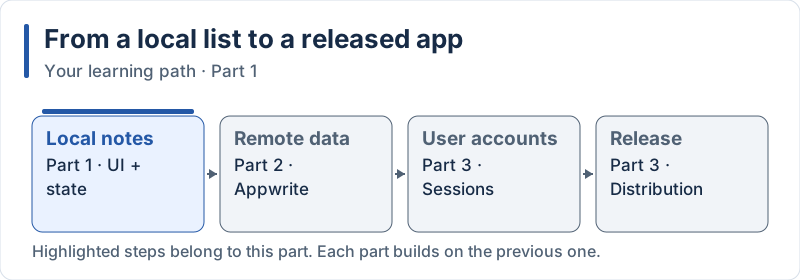
The highlighted steps are developed in this part.
Table of Contents
- Introduction to Native Android with Kotlin and Compose
- Development Environment Setup
- Project Structure and Fundamentals
- UI Components and Styling
- Building the Notes App
- Compose vs React Native vs Flutter Comparison
Parts 2 and 3 continue with: 6. Database Integration with Appwrite, 7. Authentication, 8. Filtering User Notes, 9. Empty State, 10. Building and Publishing.
1. Introduction to Native Android with Kotlin and Compose
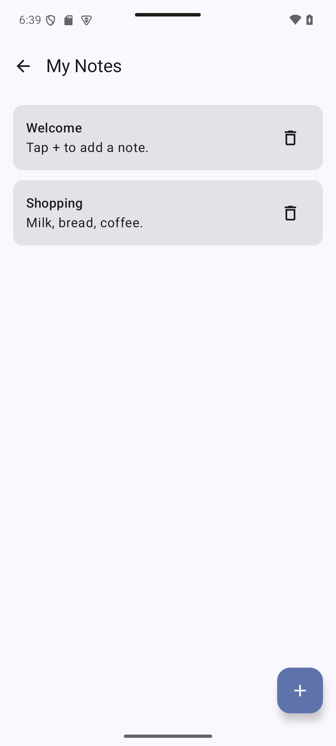
Expected result — native UI preview. Target for this part: a local list with two cards and an Add note button.
Concepts in this section:
- What “native” means: the platform’s own language, SDK, tools and UI toolkit
- Kotlin: the language Google recommends for Android
- Jetpack Compose: a declarative UI toolkit, built on the same idea as React and Flutter
- What native costs and what it brings, compared to cross-platform
Visual guide. Follow each row from the source language to the visible interface.
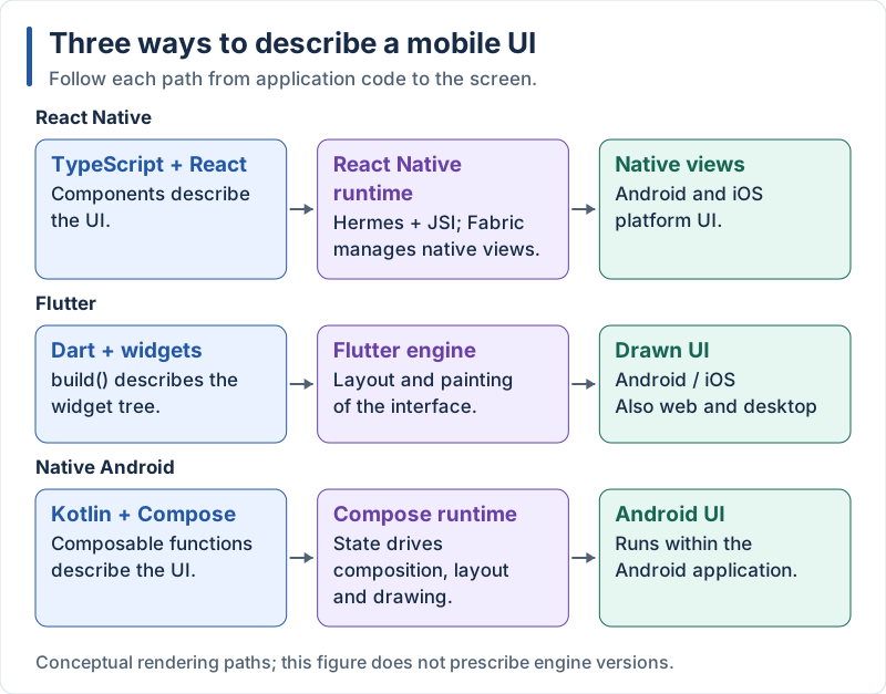
The three approaches share declarative UI ideas, but use different rendering paths.
Native Android Overview
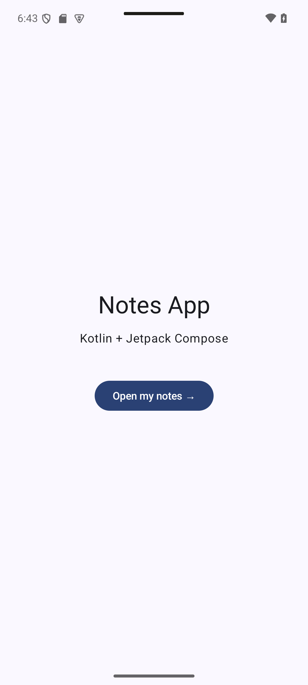
Expected result — native UI preview. Compose renders the Notes App screen using native Android UI components.
Native Android development means using the tools provided by Google for the platform:
- Language: Kotlin (Java is still supported, but new APIs and documentation are Kotlin-first)
- IDE: Android Studio (based on IntelliJ)
- Build system: Gradle with the Android Gradle Plugin
- UI toolkit: Jetpack Compose (the older XML layouts and
Viewsystem still exist but are no longer the starting point) - Libraries: Jetpack (AndroidX): ViewModel, Navigation, DataStore, Room…
Key Characteristics of Jetpack Compose:
- UI is described with functions annotated with
@Composable(similar to React function components, or to Flutter widgets) - Declarative: the UI is a function of the state. When the state changes, Compose calls the affected functions again (recomposition)
- No XML, no
findViewById: UI and logic are written in Kotlin - Direct access to every Android API, on the day it is released
- Live Previews in Android Studio (
@Preview), plus Live Edit on a running device
Architecture: A Compose app runs on the Android Runtime (ART). Compose draws the UI itself on a canvas (like Flutter), but it is part of the platform libraries and uses Android’s text, accessibility, input and system services. Material 3 provides the ready-made components, with dynamic color (the app takes its colors from the user’s wallpaper on Android 12+).
Comparison Between Cross-Platform and Native
Expected result — native UI preview. Compare the same Notes use case across frameworks; this capture is the Kotlin / Compose implementation.
| Aspect | React Native | Flutter | Kotlin + Compose (native) |
|---|---|---|---|
| Target platforms | Android, iOS, web | Android, iOS, web, desktop | Android (phones, tablets, Wear OS, TV, cars) |
| Language | TypeScript | Dart | Kotlin |
| UI | Native views (Fabric) | Own engine (Impeller) | Compose (part of the platform libraries) |
| New platform features | Wait for a library or write a native module | Wait for a plugin or write platform code | Available immediately |
| Code sharing with iOS | ~100% | ~100% | None (unless you add Kotlin Multiplatform) |
| Tooling | Expo, VS Code | Flutter SDK, VS Code / Studio | Android Studio (the reference IDE) |
| Learning curve | Easy if you know React | New language and widgets | Kotlin + Android concepts (lifecycle, Gradle) |
| Typical choice when… | One team, two stores, web skills | One team, custom UI everywhere | Best Android quality, deep OS integration |
2. Development Environment Setup
Reference checkpoint. Reference checklist: finish setup, run the project, then compare your result with the Hello screen in section 3.
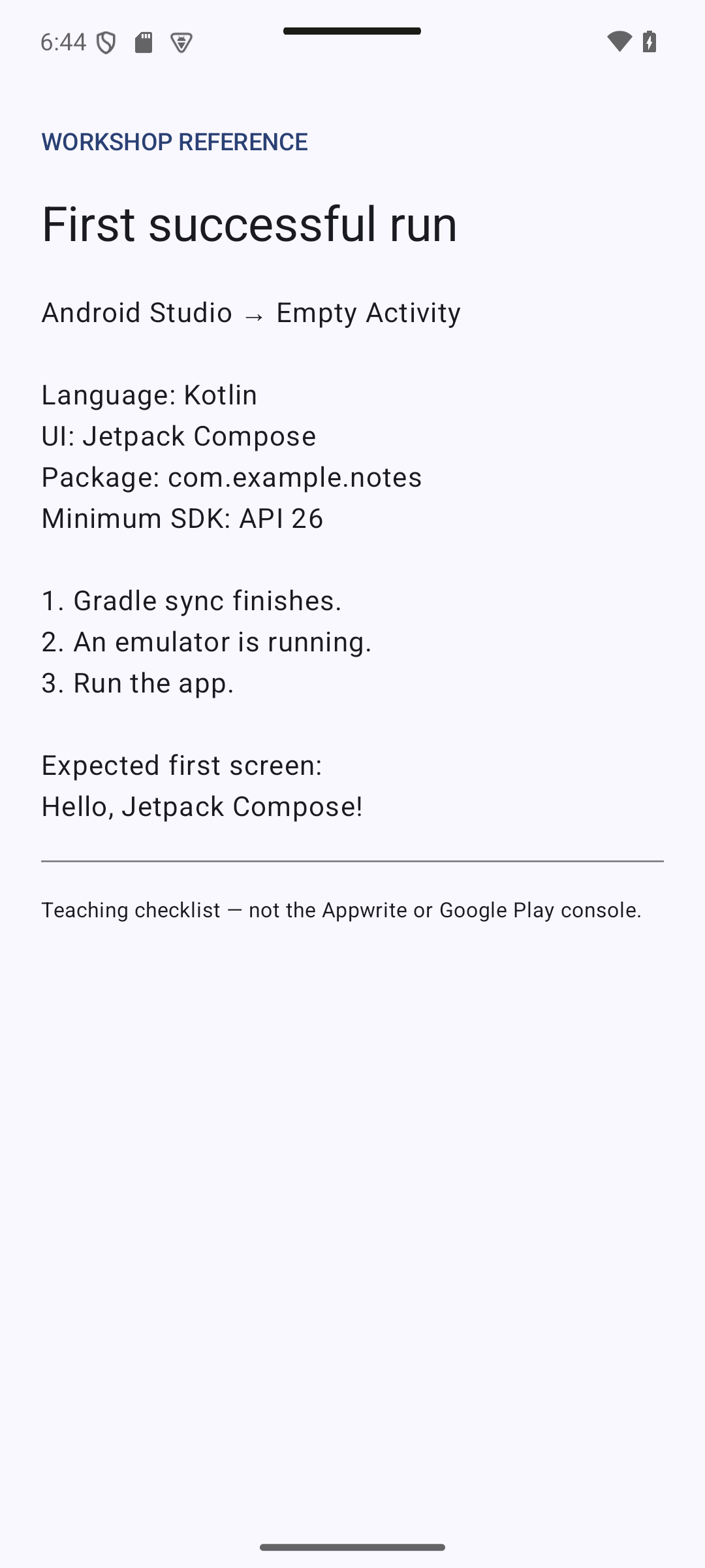
Concepts in this section:
- Android Studio bundles everything: JDK, SDK manager, emulator, Gradle integration
- Android Virtual Device (AVD): the emulator
- A project is generated from a template; we use Empty Activity (Compose)
Visual guide. Follow the toolchain from setup to a visible result on the device.
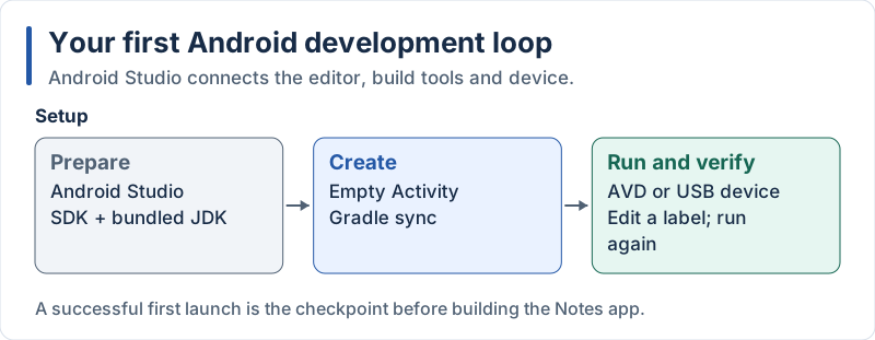
Checkpoint: launch the starter app, edit a label, and verify the change.
Setting Up Android Studio
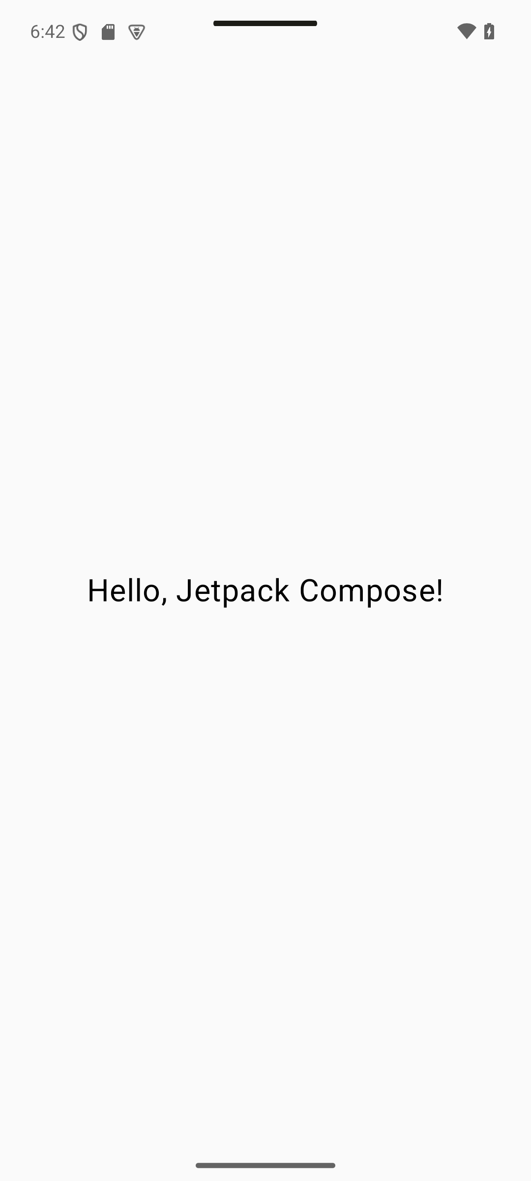
Expected result — native UI preview. After the section 3 entry point is added, Run should show Hello, Jetpack Compose! on the emulator.
Steps:
-
Install Android Studio from https://developer.android.com/studio and run the setup wizard (it installs the Android SDK).
-
Create an emulator: Tools → Device Manager → Create Device, choose a recent Pixel phone and a recent system image (download it when asked). You can also use a real phone with Developer options → USB debugging.
-
Create a new project: New Project → Phone and Tablet → Empty Activity (the one with the Compose logo), then:
Field Value Name NotesPackage name com.example.notesSave location any folder Minimum SDK API 26 (Android 8.0) Build configuration language Kotlin DSL ( build.gradle.kts) -
Wait for the first Gradle sync (it downloads dependencies; the first time takes a few minutes).
-
Run the app: choose your emulator in the toolbar and press Run ▶. You should see a “Hello Android!” screen.
Tip: the wizard may generate files slightly different from the ones shown below (Studio is updated every few weeks). Keep what it generated and add the lines that are specific to this tutorial. Keep the launcher icon attributes the wizard put in
AndroidManifest.xml.
3. Project Structure and Fundamentals
Expected result — native UI preview. The activity fills the screen and centers Hello, Jetpack Compose!
Concepts in this section:
- Anatomy of an Android project: modules, Gradle files,
AndroidManifest.xml, resources - The version catalog (
libs.versions.toml): one place for all library versions - An Activity is the entry point;
setContent { }switches to Compose - A composable function is the basic building block (the equivalent of a component / widget)
Visual guide. Trace the entry path before reading the generated files.
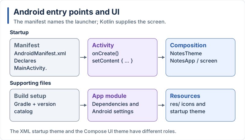
Configuration supports the project; the entry path leads to the first screen.
Visual guide. Locate the module build file between the version catalog and the selected Compose libraries.
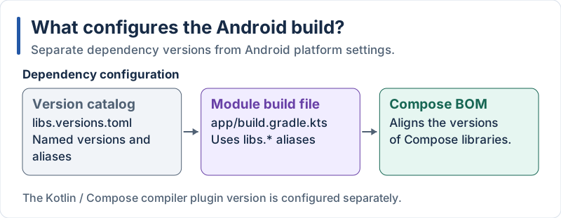
The BOM aligns Compose library versions; it does not choose the Kotlin compiler version.
Visual guide. Ask three different questions: install where, compile against what, and target which behavior?
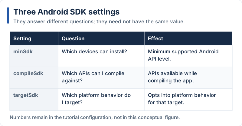
These roles stay the same when the numeric API levels change.
Android Project Structure
Reference checkpoint. Reference checklist: identify the entry point, theme, manifest and app module. This section does not add a new screen.
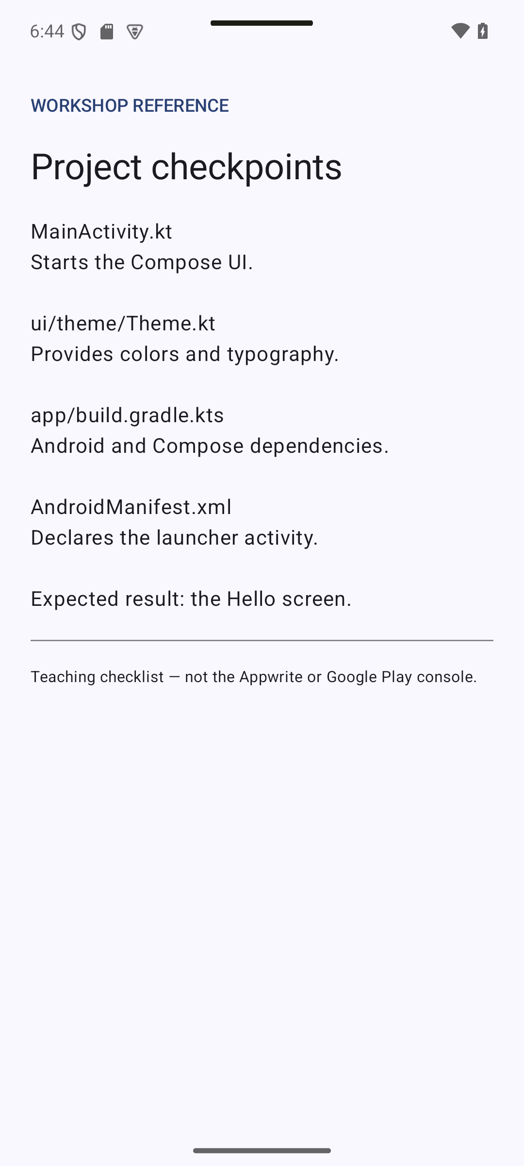
Notes/
├── gradle/
│   └── libs.versions.toml           // Version catalog: all versions in one place
├── build.gradle.kts                 // Project-level build file (plugins, versions)
├── settings.gradle.kts              // Project name and modules
├── app/                             // The "app" module
│   ├── build.gradle.kts             // Module build file: SDK versions, dependencies
│   └── src/main/
│       ├── AndroidManifest.xml      // App declaration: activities, permissions
│       ├── java/com/example/notes/  // Kotlin source code (yes, the folder is called "java")
│       │   ├── MainActivity.kt
│       │   └── ui/theme/Theme.kt
│       └── res/                     // Resources: strings, themes, icons
Add the libraries we need in this part to the version catalog:
# gradle/libs.versions.toml
[versions]
agp = "9.4.1"
kotlin = "2.4.20"
composeBom = "2026.09.00"
activityCompose = "1.13.0"
coreKtx = "1.19.1"
lifecycle = "2.11.0"
navigation3 = "1.2.0"
serialization = "1.11.0"

[libraries]
androidx-core-ktx = { group = "androidx.core", name = "core-ktx", version.ref = "coreKtx" }
androidx-activity-compose = { group = "androidx.activity", name = "activity-compose", version.ref = "activityCompose" }
androidx-compose-bom = { group = "androidx.compose", name = "compose-bom", version.ref = "composeBom" }
androidx-compose-ui = { group = "androidx.compose.ui", name = "ui" }
androidx-compose-ui-tooling = { group = "androidx.compose.ui", name = "ui-tooling" }
androidx-compose-ui-tooling-preview = { group = "androidx.compose.ui", name = "ui-tooling-preview" }
androidx-compose-material3 = { group = "androidx.compose.material3", name = "material3" }
androidx-compose-material-icons-core = { group = "androidx.compose.material", name = "material-icons-core" }
androidx-lifecycle-viewmodel-compose = { group = "androidx.lifecycle", name = "lifecycle-viewmodel-compose", version.ref = "lifecycle" }
androidx-lifecycle-runtime-compose = { group = "androidx.lifecycle", name = "lifecycle-runtime-compose", version.ref = "lifecycle" }
androidx-lifecycle-viewmodel-navigation3 = { group = "androidx.lifecycle", name = "lifecycle-viewmodel-navigation3", version.ref = "lifecycle" }
androidx-navigation3-runtime = { group = "androidx.navigation3", name = "navigation3-runtime", version.ref = "navigation3" }
androidx-navigation3-ui = { group = "androidx.navigation3", name = "navigation3-ui", version.ref = "navigation3" }
kotlinx-serialization-json = { group = "org.jetbrains.kotlinx", name = "kotlinx-serialization-json", version.ref = "serialization" }

[plugins]
android-application = { id = "com.android.application", version.ref = "agp" }
kotlin-compose = { id = "org.jetbrains.kotlin.plugin.compose", version.ref = "kotlin" }
kotlin-serialization = { id = "org.jetbrains.kotlin.plugin.serialization", version.ref = "kotlin" }
// build.gradle.kts
plugins {
alias(libs.plugins.android.application) apply false
alias(libs.plugins.kotlin.compose) apply false
alias(libs.plugins.kotlin.serialization) apply false
}The wizard also generated settings.gradle.kts. Just check that it declares the two repositories where our libraries live (google() and mavenCentral()):
// settings.gradle.kts
pluginManagement {
    repositories {
        google()
        mavenCentral()
        gradlePluginPortal()
    }
}
dependencyResolutionManagement {
    repositoriesMode.set(RepositoriesMode.FAIL_ON_PROJECT_REPOS)
    repositories {
        google()
        mavenCentral()
    }
}

rootProject.name = "Notes"
include(":app")
// app/build.gradle.kts
plugins {
alias(libs.plugins.android.application)
alias(libs.plugins.kotlin.compose)
alias(libs.plugins.kotlin.serialization)
}
android {
namespace = "com.example.notes"
compileSdk = 37
defaultConfig {
applicationId = "com.example.notes"
minSdk = 26
targetSdk = 36
versionCode = 1
versionName = "1.0"
}
buildTypes {
release {
isMinifyEnabled = false
}
}
compileOptions {
sourceCompatibility = JavaVersion.VERSION_17
targetCompatibility = JavaVersion.VERSION_17
}
buildFeatures {
compose = true
}
}
dependencies {
implementation(libs.androidx.core.ktx)
implementation(libs.androidx.activity.compose)
// The BOM fixes the version of every Compose library: no version on the lines below
implementation(platform(libs.androidx.compose.bom))
implementation(libs.androidx.compose.ui)
implementation(libs.androidx.compose.ui.tooling.preview)
implementation(libs.androidx.compose.material3)
implementation(libs.androidx.compose.material.icons.core)
debugImplementation(libs.androidx.compose.ui.tooling)
implementation(libs.androidx.lifecycle.viewmodel.compose)
implementation(libs.androidx.lifecycle.runtime.compose)
// Navigation 3 (the back stack is a list that you own)
implementation(libs.androidx.navigation3.runtime)
implementation(libs.androidx.navigation3.ui)
implementation(libs.androidx.lifecycle.viewmodel.navigation3)
implementation(libs.kotlinx.serialization.json)
}Explanation:
- The version catalog lets every
build.gradle.ktswritelibs.androidx...instead of repeating version numbers (the equivalent ofpackage.jsonfor versions andpubspec.yaml) - The Compose BOM (Bill of Materials) picks a set of Compose library versions that are tested together: you only choose the BOM version
- The Compose compiler plugin (
kotlin.compose) is what turns@Composablefunctions into UI code; its version is the Kotlin version - The serialization plugin is needed by Navigation 3 (section 5.1) to save the back stack
material-icons-coreprovides the basic icons (Icons.Filled.Add,Icons.Outlined.Delete…)minSdk = 26covers practically all active devices.compileSdkis the Android API you compile against: recent Compose libraries require a recent one (the build fails with a clear message when a library needs a higher value).targetSdkis the Android behavior you have tested your app on, and Google Play requires a recent one. They can be different- After editing Gradle files click Sync Now in Studio
Now the Android entry points. The manifest declares the app and its launcher activity:
<?xml version="1.0" encoding="utf-8"?>
<!-- app/src/main/AndroidManifest.xml -->
<manifest xmlns:android="http://schemas.android.com/apk/res/android">

    <application
        android:allowBackup="true"
        android:label="Notes"
        android:supportsRtl="true"
        android:theme="@style/Theme.Notes">
        <activity
            android:name=".MainActivity"
            android:exported="true">
            <intent-filter>
                <action android:name="android.intent.action.MAIN" />
                <category android:name="android.intent.category.LAUNCHER" />
            </intent-filter>
        </activity>
    </application>

</manifest>
<?xml version="1.0" encoding="utf-8"?>
<!-- app/src/main/res/values/themes.xml -->
<resources>
<style name="Theme.Notes" parent="android:Theme.Material.Light.NoActionBar" />
</resources>Explanation:
AndroidManifest.xmlis the app’s identity card: its activities, permissions and launcher entry. (Remember to keep theandroid:iconandandroid:roundIconlines generated by the wizard.)exported="true"plus theMAIN/LAUNCHERfilter makeMainActivitythe screen started from the home screen of the phone- The XML theme only sets the window background and status bar before Compose draws; the real theme is written in Compose below
The theme, written in Kotlin:
// app/src/main/java/com/example/notes/ui/theme/Theme.kt
package com.example.notes.ui.theme

import android.os.Build
import androidx.compose.foundation.isSystemInDarkTheme
import androidx.compose.material3.MaterialTheme
import androidx.compose.material3.darkColorScheme
import androidx.compose.material3.dynamicDarkColorScheme
import androidx.compose.material3.dynamicLightColorScheme
import androidx.compose.material3.lightColorScheme
import androidx.compose.runtime.Composable
import androidx.compose.ui.graphics.Color
import androidx.compose.ui.platform.LocalContext

private val LightColors = lightColorScheme(primary = Color(0xFF208AEF))
private val DarkColors = darkColorScheme(primary = Color(0xFF7DB8FF))

@Composable
fun NotesTheme(
    darkTheme: Boolean = isSystemInDarkTheme(),
    content: @Composable () -> Unit,
) {
    val context = LocalContext.current
    val colorScheme = when {
        // Dynamic color: colors taken from the user's wallpaper (Android 12+)
        Build.VERSION.SDK_INT >= Build.VERSION_CODES.S ->
            if (darkTheme) dynamicDarkColorScheme(context) else dynamicLightColorScheme(context)
        darkTheme -> DarkColors
        else -> LightColors
    }
    MaterialTheme(colorScheme = colorScheme, content = content)
}
Explanation:
@Composablemarks a function that describes UI. It can only be called from another composable function (or fromsetContent)content: @Composable () -> Unitis a slot: the theme wraps whatever UI you give it. This is the Compose equivalent ofchildrenin ReactMaterialThemeprovides colors, typography and shapes to every component below it, through an implicit mechanism calledCompositionLocal(like React Context)- Dark mode and dynamic color work in 10 lines; fallback colors are used on Android 11 and below
Finally the activity:
// app/src/main/java/com/example/notes/MainActivity.kt
package com.example.notes

import android.os.Bundle
import androidx.activity.ComponentActivity
import androidx.activity.compose.setContent
import androidx.activity.enableEdgeToEdge
import androidx.compose.foundation.layout.Box
import androidx.compose.foundation.layout.fillMaxSize
import androidx.compose.material3.Text
import androidx.compose.ui.Alignment
import androidx.compose.ui.Modifier
import androidx.compose.ui.unit.sp
import com.example.notes.ui.theme.NotesTheme

class MainActivity : ComponentActivity() {
    override fun onCreate(savedInstanceState: Bundle?) {
        super.onCreate(savedInstanceState)
        enableEdgeToEdge() // draw behind the system bars
        setContent {
            NotesTheme {
                Box(Modifier.fillMaxSize(), contentAlignment = Alignment.Center) {
                    Text("Hello, Jetpack Compose!", fontSize = 24.sp)
                }
            }
        }
    }
}
Explanation:
- An Activity is an Android screen container and the app’s entry point.
onCreateis called when it starts setContent { }is where the View world ends and Compose startsBoxstacks its children,Modifier.fillMaxSize()makes it as big as its parent, andcontentAlignmentcenters the child24.spis a scalable pixel for text (it follows the user’s font size setting);dpis the unit for sizes and spacingenableEdgeToEdge()is required for modern Android: the app draws under the status and navigation bars, and we add padding withScaffold(section 5)
4. UI Components and Styling
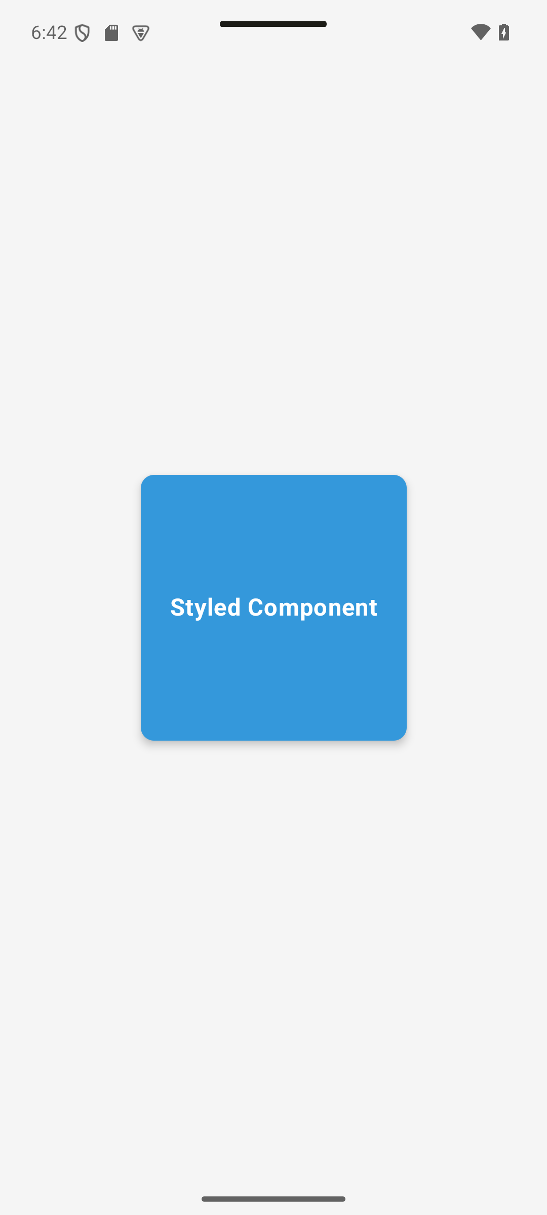
Expected result — native UI preview. A blue rounded square is centered on a light background; its label is white and bold.
Concepts in this section:
- Core components:
Text,Image,TextField,Button,LazyColumn,Scaffold - Modifiers: the way to size, pad, decorate and make a composable clickable. The order matters.
- Layout:
Column,Row,Boxand weights (instead of Flexbox orExpanded)
Visual guide. Match each region of this schematic screen to a component name.
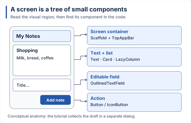
The form is shown inside the screen only to label its parts; the code opens it in a dialog.
Compose Components and Styling
Expected result — native UI preview. Compare the size, corner radius, shadow and text alignment with StyleDemo.
Visual guide. Compare the outer padding area in both examples before reading the Modifier chain.
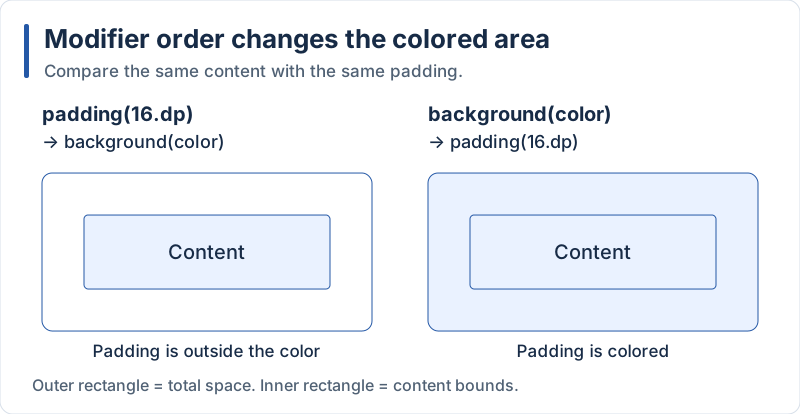
Both reserve padding, but only the second colors the padding area.
Compose provides small building blocks that you combine:
Text: displays textImage/Icon: displays a picture or a vector iconOutlinedTextField/TextField: text inputButton,TextButton,IconButton: touchable elementsBox: a container that stacks children (similar toView)Column/Row: vertical / horizontal layoutLazyColumn: scrollable list that only composes the visible rows (likeFlatListorListView.builder)Card,Scaffold,TopAppBar,AlertDialog: Material 3 components
Styling Example:
// app/src/main/java/com/example/notes/demo/StyleDemo.kt
package com.example.notes.demo

import androidx.compose.foundation.background
import androidx.compose.foundation.layout.Box
import androidx.compose.foundation.layout.fillMaxSize
import androidx.compose.foundation.layout.size
import androidx.compose.foundation.shape.RoundedCornerShape
import androidx.compose.material3.Text
import androidx.compose.runtime.Composable
import androidx.compose.ui.Alignment
import androidx.compose.ui.Modifier
import androidx.compose.ui.draw.shadow
import androidx.compose.ui.graphics.Color
import androidx.compose.ui.text.font.FontWeight
import androidx.compose.ui.tooling.preview.Preview
import androidx.compose.ui.unit.dp
import androidx.compose.ui.unit.sp

@Composable
fun StyleDemo() {
    Box(
        modifier = Modifier
            .fillMaxSize()
            .background(Color(0xFFF5F5F5)),
        contentAlignment = Alignment.Center,
    ) {
        Box(
            modifier = Modifier
                .size(200.dp)
                .shadow(elevation = 4.dp, shape = RoundedCornerShape(10.dp))
                .background(Color(0xFF3498DB), RoundedCornerShape(10.dp)),
            contentAlignment = Alignment.Center,
        ) {
            Text(
                text = "Styled Component",
                color = Color.White,
                fontSize = 18.sp,
                fontWeight = FontWeight.Bold,
            )
        }
    }
}

@Preview(showBackground = true)
@Composable
private fun StyleDemoPreview() {
    StyleDemo()
}
Explanation:
- There is no stylesheet: appearance is set with parameters (
color,fontSize) and with aModifierchain - A
Modifieris applied from the first call to the last..shadow(...).background(...)is not the same as.background(...).shadow(...), and.padding(16.dp).background(color)leaves the padding outside the colored area, while.background(color).padding(16.dp)puts it inside @Previewmakes Android Studio render the composable in the editor without running the app: open the Split viewdpfor sizes,spfor text: Compose has nopxin everyday code- Named arguments (
color = Color.White) are idiomatic Kotlin and make composable calls readable
Layout in Compose
Expected result — native UI preview. Header and Footer keep fixed heights; Content occupies the remaining vertical space.
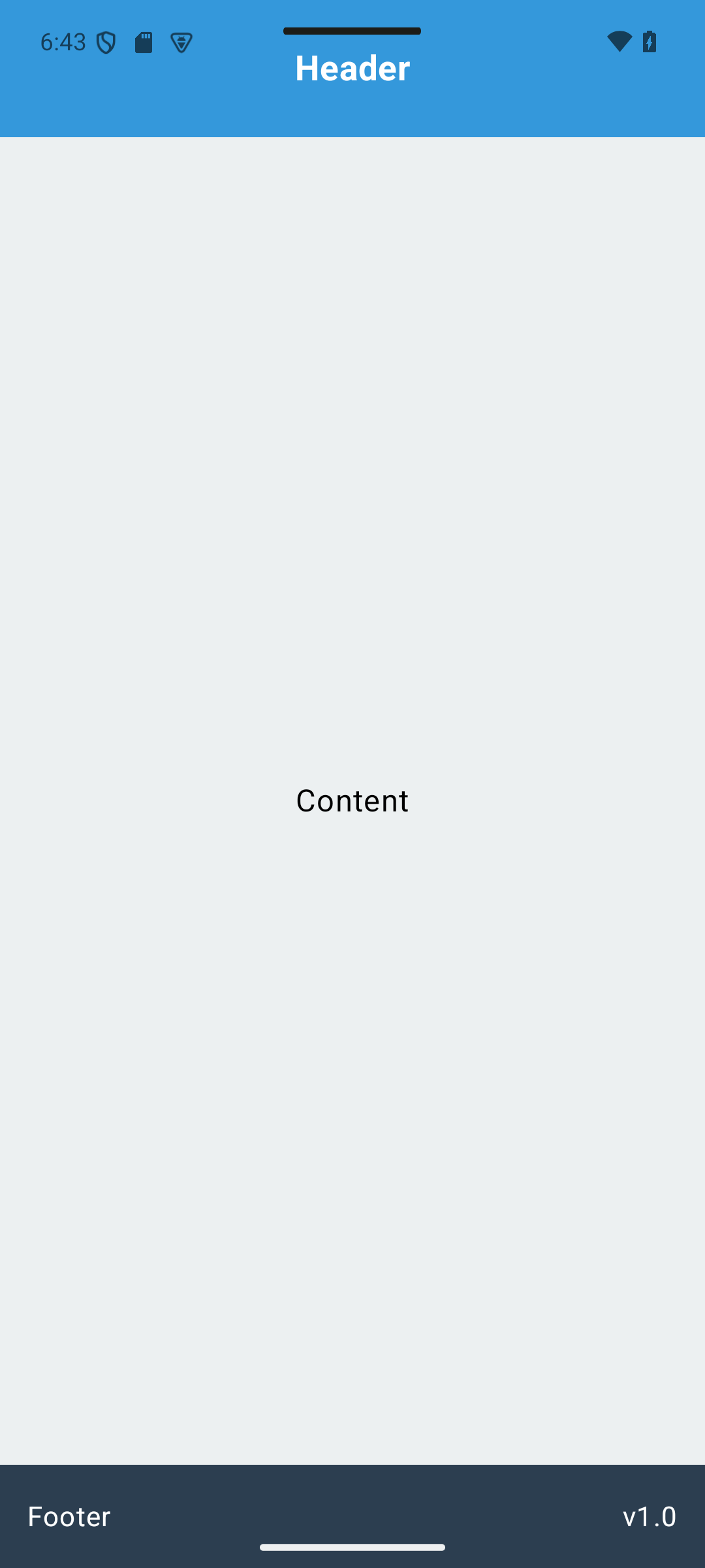
Visual guide. First identify the main axis, then find the child that receives the remaining space.
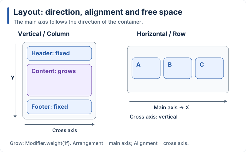
Header and footer keep their size while the content area grows.
Visual guide. Use overlap to distinguish Box from the sequential layouts above.
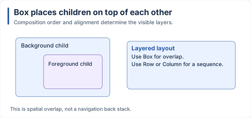
Later foreground content can cover earlier background content.
Compose has three basic layouts: Column (vertical), Row (horizontal) and Box (stacked). There is no Flexbox: weights play the role of flex: 1 and Expanded.
// app/src/main/java/com/example/notes/demo/LayoutDemo.kt
package com.example.notes.demo

import androidx.compose.foundation.background
import androidx.compose.foundation.layout.Arrangement
import androidx.compose.foundation.layout.Box
import androidx.compose.foundation.layout.Column
import androidx.compose.foundation.layout.Row
import androidx.compose.foundation.layout.fillMaxSize
import androidx.compose.foundation.layout.fillMaxWidth
import androidx.compose.foundation.layout.height
import androidx.compose.foundation.layout.padding
import androidx.compose.material3.Text
import androidx.compose.runtime.Composable
import androidx.compose.ui.Alignment
import androidx.compose.ui.Modifier
import androidx.compose.ui.graphics.Color
import androidx.compose.ui.text.font.FontWeight
import androidx.compose.ui.tooling.preview.Preview
import androidx.compose.ui.unit.dp
import androidx.compose.ui.unit.sp

@Composable
fun LayoutDemo() {
    Column(modifier = Modifier.fillMaxSize()) {
        // Header: fixed height
        Box(
            modifier = Modifier
                .fillMaxWidth()
                .height(80.dp)
                .background(Color(0xFF3498DB)),
            contentAlignment = Alignment.Center,
        ) {
            Text("Header", color = Color.White, fontSize = 20.sp, fontWeight = FontWeight.Bold)
        }

        // Content: takes all the remaining height
        Box(
            modifier = Modifier
                .fillMaxWidth()
                .weight(1f)
                .background(Color(0xFFECF0F1)),
            contentAlignment = Alignment.Center,
        ) {
            Text("Content", fontSize = 18.sp)
        }

        // Footer: a Row with two items spaced evenly
        Row(
            modifier = Modifier
                .fillMaxWidth()
                .height(60.dp)
                .background(Color(0xFF2C3E50))
                .padding(horizontal = 16.dp),
            horizontalArrangement = Arrangement.SpaceBetween,
            verticalAlignment = Alignment.CenterVertically,
        ) {
            Text("Footer", color = Color.White, fontSize = 16.sp)
            Text("v1.0", color = Color.White, fontSize = 16.sp)
        }
    }
}

@Preview(showBackground = true)
@Composable
private fun LayoutDemoPreview() {
    LayoutDemo()
}
Explanation:
Columnstacks children vertically;Arrangementcontrols the spacing along the main axis (likejustifyContent) andAlignmentthe position on the cross axis (likealignItems)Modifier.weight(1f)(only available insideColumn/Row) gives a child the remaining space, exactly likeflex: 1in React Native orExpandedin FlutterfillMaxWidth()makes a child as wide as its parent. By default a composable is only as big as its contentArrangement.spacedBy(12.dp)adds a gap between children (equivalent ofgap/spacing:)
5. Building the Notes App
Expected result — native UI preview. The final local flow starts on Home and opens My Notes.
Concepts in this section:
- Navigation: a back stack of screens (Navigation 3: the back stack is a plain list you control)
- State: values that, when they change, make Compose redraw the UI (
remember,mutableStateOf) - Lists:
LazyColumnwith stable keys - State hoisting: a composable receives its state and callbacks as parameters, instead of owning them
- ViewModel: a class that holds the screen’s state and survives configuration changes (rotation)
- Unidirectional data flow: state flows down, events flow up
For now notes live in memory: they disappear when the app process dies. We fix that in Part 2.
5.1 Setting up Navigation
Expected result — native UI preview. Open my notes opens the list; Back returns to Home. Captures show the destination UI; the preview harness does not validate the Navigation 3 back stack.
Concepts in this section: screens are identified by keys (small serializable objects); the back stack is a list of keys; NavDisplay shows the last one.
Visual guide. Read the stack from left to right and identify which screen is visible after each action.
![Open Notes, then return: Start — [Home] Home is visible. → add(Notes) — [Home, Notes] Notes is visible. → Remove last — [Home] Home is visible again.](/mobile-dev/svg/compose/navigation.svg)
Navigation state determines the visible screen; the examples below provide the exact API calls.
Create the following structure:
app/src/main/java/com/example/notes/
├── MainActivity.kt
├── NotesApp.kt              // Navigation
├── model/
│   └── Note.kt
├── ui/
│   ├── theme/Theme.kt
│   ├── HomeScreen.kt
│   ├── NotesScreen.kt
│   ├── NotesViewModel.kt
│   ├── NoteItem.kt
│   └── NoteInputDialog.kt
Define the screens as NavKey objects:
// app/src/main/java/com/example/notes/Routes.kt
package com.example.notes

import androidx.navigation3.runtime.NavKey
import kotlinx.serialization.Serializable

@Serializable
data object Home : NavKey

@Serializable
data object Notes : NavKey
// app/src/main/java/com/example/notes/NotesApp.kt
package com.example.notes
import androidx.compose.runtime.Composable
import androidx.lifecycle.viewmodel.navigation3.rememberViewModelStoreNavEntryDecorator
import androidx.navigation3.runtime.entryProvider
import androidx.navigation3.runtime.rememberNavBackStack
import androidx.navigation3.runtime.rememberSaveableStateHolderNavEntryDecorator
import androidx.navigation3.ui.NavDisplay
import com.example.notes.ui.HomeScreen
import com.example.notes.ui.NotesScreen
@Composable
fun NotesApp() {
// The back stack: a list of keys, saved across rotation and process death
val backStack = rememberNavBackStack(Home)
NavDisplay(
backStack = backStack,
onBack = { backStack.removeLastOrNull() },
entryDecorators = listOf(
rememberSaveableStateHolderNavEntryDecorator(),
rememberViewModelStoreNavEntryDecorator(), // one ViewModel store per screen
),
entryProvider = entryProvider {
entry<Home> {
HomeScreen(onOpenNotes = { backStack.add(Notes) })
}
entry<Notes> {
NotesScreen(onBack = { backStack.removeLastOrNull() })
}
},
)
}Use it from the activity (replace the Box with Hello created earlier):
// app/src/main/java/com/example/notes/MainActivity.kt
package com.example.notes

import android.os.Bundle
import androidx.activity.ComponentActivity
import androidx.activity.compose.setContent
import androidx.activity.enableEdgeToEdge
import com.example.notes.ui.theme.NotesTheme

class MainActivity : ComponentActivity() {
    override fun onCreate(savedInstanceState: Bundle?) {
        super.onCreate(savedInstanceState)
        enableEdgeToEdge()
        setContent {
            NotesTheme {
                NotesApp()
            }
        }
    }
}
Explanation:
HomeandNotesare the “routes”. They are@Serializableso that Android can save and restore the back stack (after rotation or if the system kills the process)rememberNavBackStack(Home)creates the back stack withHomeat the bottom. It behaves like a mutable list:add(Notes)navigates forward,removeLastOrNull()goes backNavDisplayalways displays the last entry and handles the system back gesture throughonBackentryProvider { entry<Home> { ... } }maps each key type to the composable to display- The ViewModel decorator makes
viewModel()calls inside an entry return a ViewModel that lives as long as that entry is on the back stack - Compare: React Native uses files as routes (Expo Router), Flutter lists
GoRoutes. Here the navigation state is just a list you own, so a login guard (Part 3) is simply “replace the list”
Alternative: you may also meet Navigation Compose (
NavHost+composable("route")), the previous library. It is still maintained and used in many existing projects, but Navigation 3 is the recommended choice for new Compose apps.
5.2 Home Screen
Expected result — native UI preview. Center the app title, subtitle and Open my notes button.
Visual guide. Use the navigation diagram in section 5.1: the Home button opens the Notes destination.
// app/src/main/java/com/example/notes/ui/HomeScreen.kt
package com.example.notes.ui

import androidx.compose.foundation.layout.Arrangement
import androidx.compose.foundation.layout.Column
import androidx.compose.foundation.layout.Spacer
import androidx.compose.foundation.layout.fillMaxSize
import androidx.compose.foundation.layout.height
import androidx.compose.foundation.layout.padding
import androidx.compose.material3.Button
import androidx.compose.material3.MaterialTheme
import androidx.compose.material3.Scaffold
import androidx.compose.material3.Text
import androidx.compose.runtime.Composable
import androidx.compose.ui.Alignment
import androidx.compose.ui.Modifier
import androidx.compose.ui.tooling.preview.Preview
import androidx.compose.ui.unit.dp
import com.example.notes.ui.theme.NotesTheme

@Composable
fun HomeScreen(
    onOpenNotes: () -> Unit,
    modifier: Modifier = Modifier,
) {
    Scaffold(modifier = modifier) { innerPadding ->
        Column(
            modifier = Modifier
                .fillMaxSize()
                .padding(innerPadding),
            verticalArrangement = Arrangement.spacedBy(12.dp, Alignment.CenterVertically),
            horizontalAlignment = Alignment.CenterHorizontally,
        ) {
            Text("Notes App", style = MaterialTheme.typography.headlineLarge)
            Text("Kotlin + Jetpack Compose", style = MaterialTheme.typography.bodyLarge)
            Spacer(Modifier.height(16.dp))
            Button(onClick = onOpenNotes) {
                Text("Open my notes →")
            }
        }
    }
}

@Preview(showBackground = true)
@Composable
private fun HomeScreenPreview() {
    NotesTheme { HomeScreen(onOpenNotes = {}) }
}
Explanation:
Scaffoldis the Material page skeleton (top bar, floating button, content). Its content lambda receivesinnerPadding: apply it, otherwise the content goes under the system bars (we enabled edge-to-edge)- The screen does not know about the back stack: it receives
onOpenNotes: () -> Unit. This is state hoisting: events go up through callbacks, so the screen is easy to preview and test modifier: Modifier = Modifieras first optional parameter is a Compose convention: it lets the caller adjust the layoutMaterialTheme.typography.headlineLargereads the text style from the theme, likeTheme.of(context).textThemein FlutterButton(onClick = ...) { Text(...) }: the trailing lambda is the button’s content slot
5.3 Notes Screen
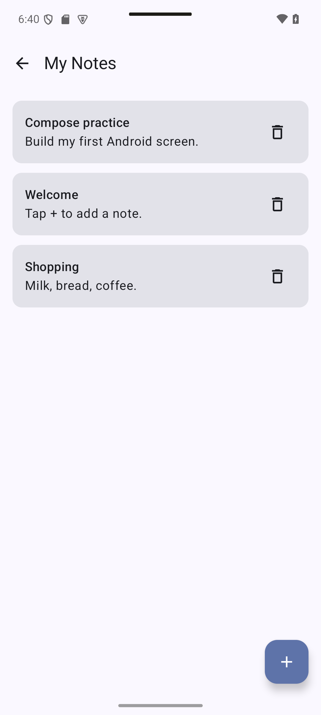
Expected result — native UI preview. Tap +, enter a title and content, then Save: the new card appears first. Tap a card to edit it; the trash icon removes it immediately in Part 1. More states: empty form and after deletion.
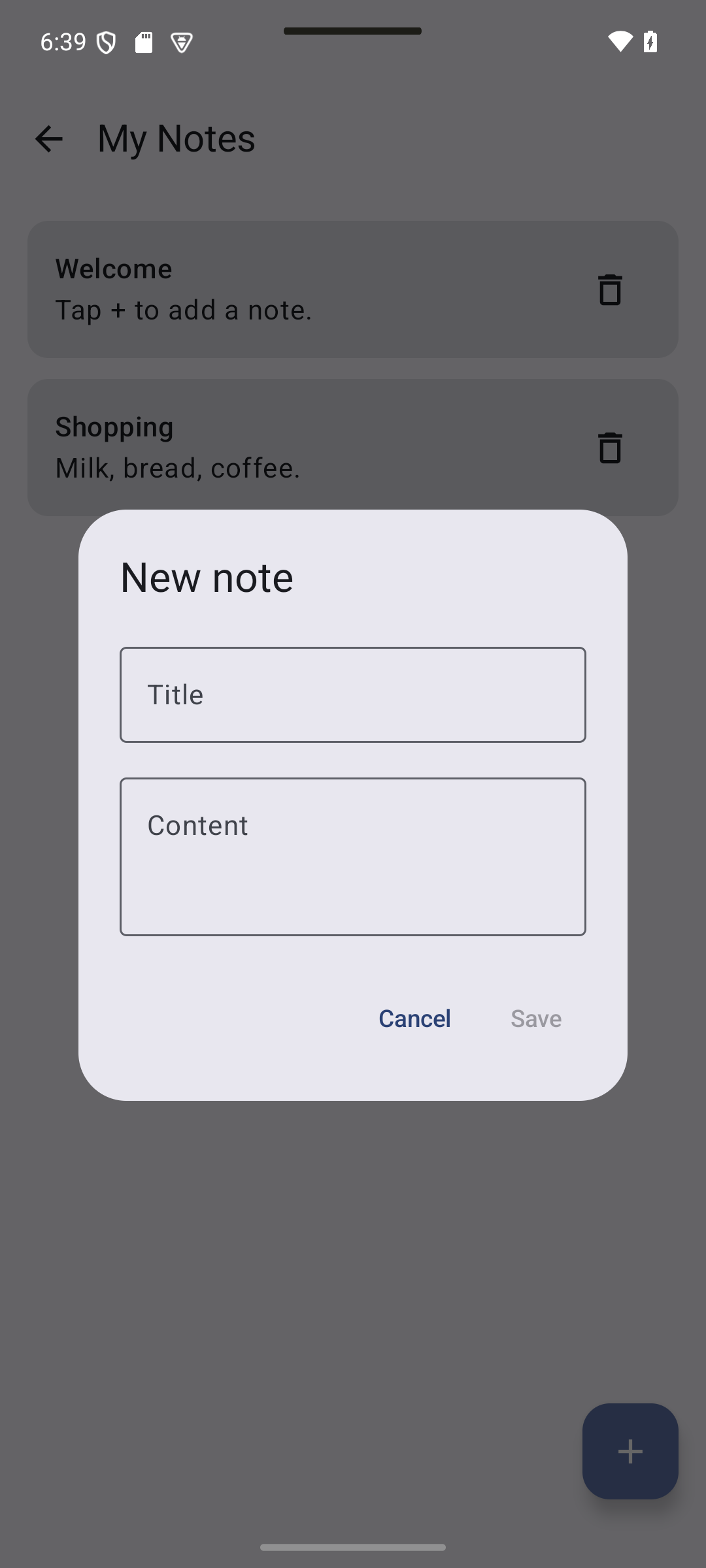
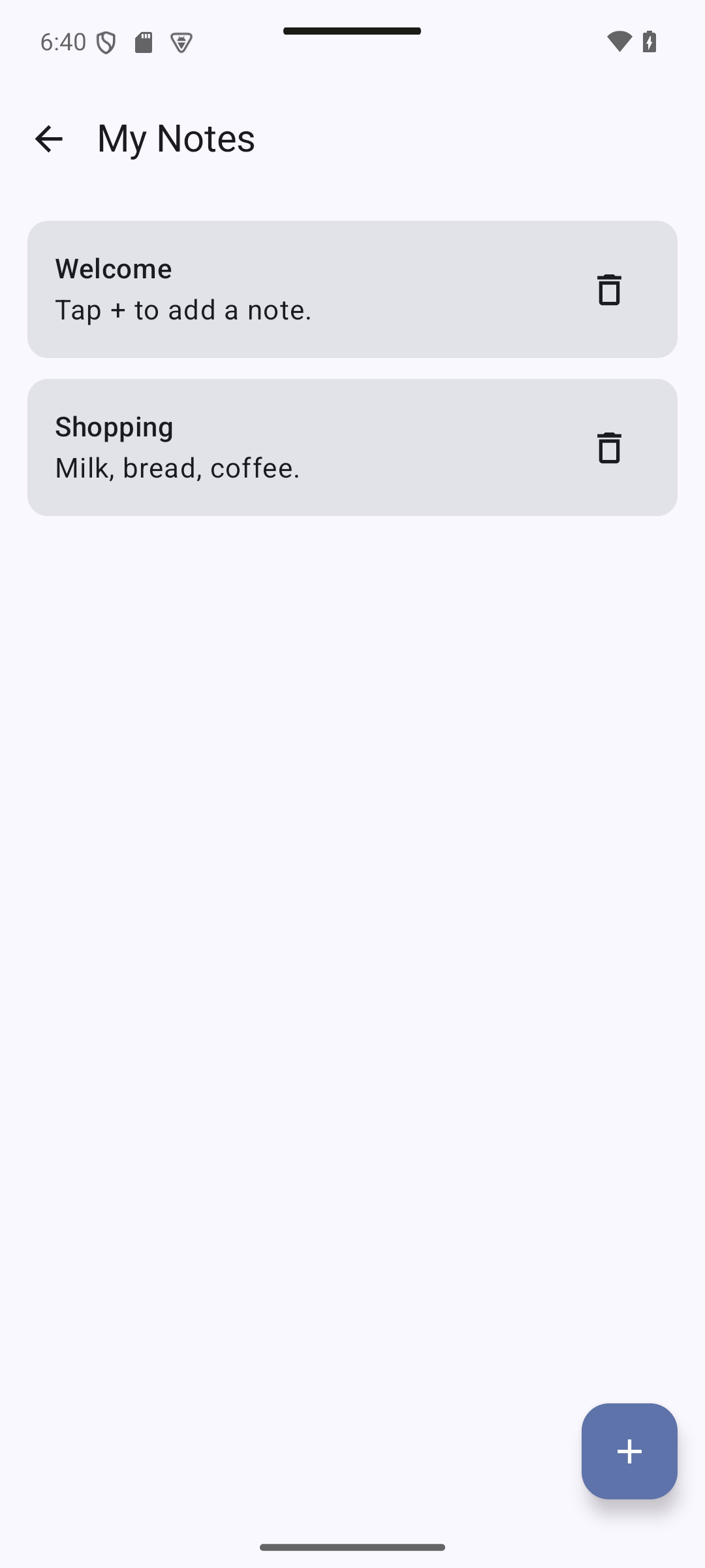
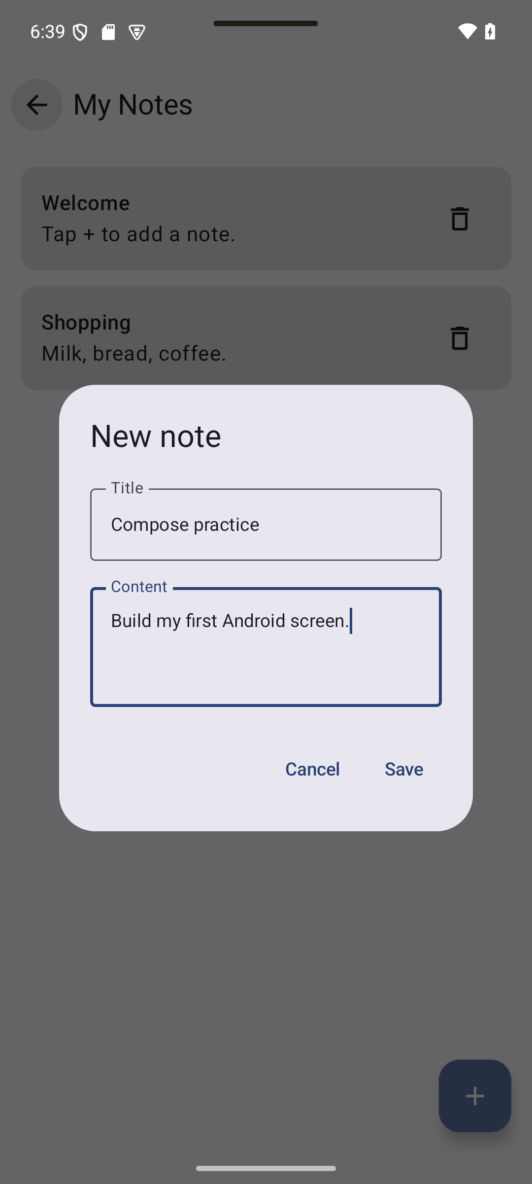
Visual guide. Follow one action through the state update, then check how ids survive list changes.
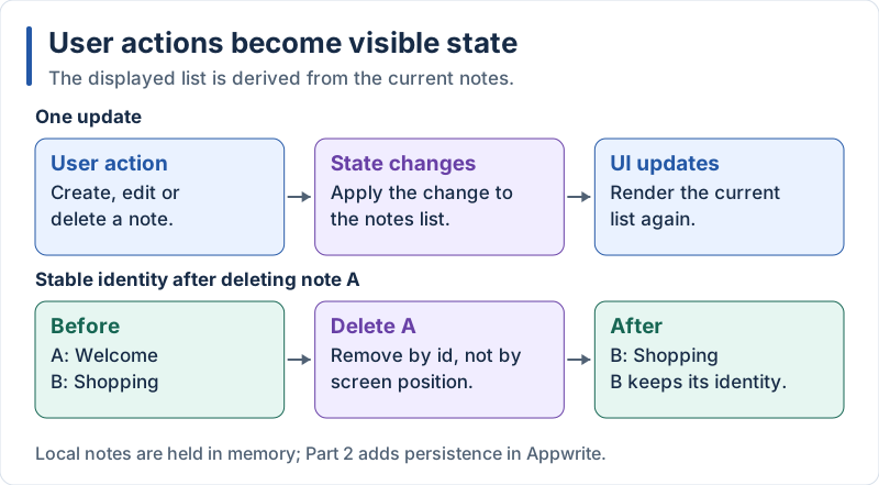
The list is local in Part 1; an id identifies a note independently of its position.
Visual guide. Compare the create and edit paths; cancellation must leave the list unchanged.
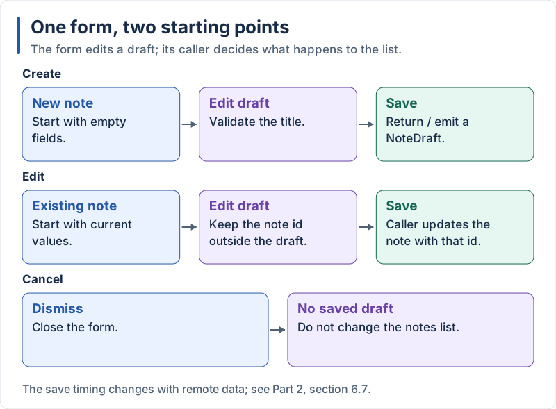
Conceptual form flow: the explicit NoteDraft contract is introduced by the refactoring in section 5.4.
Notes are described by two small data classes. A data class automatically gets equals, hashCode, toString and copy:
// app/src/main/java/com/example/notes/model/Note.kt
package com.example.notes.model

data class Note(
    val id: String,
    val title: String,
    val content: String,
)

/** Title and content typed by the user, before an id is assigned. */
data class NoteDraft(
    val title: String,
    val content: String,
)
First version: the screen keeps the list in its own state, and the dialog code is inline. This is the equivalent of the first version we wrote in React Native and Flutter.
// app/src/main/java/com/example/notes/ui/NotesScreen.kt
package com.example.notes.ui

import androidx.compose.foundation.layout.Arrangement
import androidx.compose.foundation.layout.Box
import androidx.compose.foundation.layout.Column
import androidx.compose.foundation.layout.PaddingValues
import androidx.compose.foundation.layout.Row
import androidx.compose.foundation.layout.fillMaxSize
import androidx.compose.foundation.layout.fillMaxWidth
import androidx.compose.foundation.layout.padding
import androidx.compose.foundation.lazy.LazyColumn
import androidx.compose.foundation.lazy.items
import androidx.compose.material.icons.Icons
import androidx.compose.material.icons.automirrored.filled.ArrowBack
import androidx.compose.material.icons.filled.Add
import androidx.compose.material.icons.outlined.Delete
import androidx.compose.material3.AlertDialog
import androidx.compose.material3.Card
import androidx.compose.material3.ExperimentalMaterial3Api
import androidx.compose.material3.FloatingActionButton
import androidx.compose.material3.Icon
import androidx.compose.material3.IconButton
import androidx.compose.material3.MaterialTheme
import androidx.compose.material3.OutlinedTextField
import androidx.compose.material3.Scaffold
import androidx.compose.material3.Text
import androidx.compose.material3.TextButton
import androidx.compose.material3.TopAppBar
import androidx.compose.runtime.Composable
import androidx.compose.runtime.getValue
import androidx.compose.runtime.mutableStateOf
import androidx.compose.runtime.remember
import androidx.compose.runtime.saveable.rememberSaveable
import androidx.compose.runtime.setValue
import androidx.compose.ui.Alignment
import androidx.compose.ui.Modifier
import androidx.compose.ui.text.style.TextOverflow
import androidx.compose.ui.unit.dp
import com.example.notes.model.Note
import java.util.UUID

@OptIn(ExperimentalMaterial3Api::class)
@Composable
fun NotesScreen(onBack: () -> Unit) {
    // State: when `notes` changes, Compose redraws what reads it
    var notes by remember {
        mutableStateOf(
            listOf(
                Note("1", "Welcome", "Tap + to add a note."),
                Note("2", "Shopping", "Milk, bread, coffee."),
            ),
        )
    }
    var dialogOpen by rememberSaveable { mutableStateOf(false) }
    var editingId by rememberSaveable { mutableStateOf<String?>(null) }
    var title by rememberSaveable { mutableStateOf("") }
    var content by rememberSaveable { mutableStateOf("") }

    fun openNew() {
        editingId = null
        title = ""
        content = ""
        dialogOpen = true
    }

    fun openEdit(note: Note) {
        editingId = note.id
        title = note.title
        content = note.content
        dialogOpen = true
    }

    fun save() {
        val id = editingId
        notes = if (id == null) {
            // Never modify the list in place: create a new one
            listOf(Note(UUID.randomUUID().toString(), title.trim(), content.trim())) + notes
        } else {
            notes.map { if (it.id == id) it.copy(title = title.trim(), content = content.trim()) else it }
        }
        dialogOpen = false
    }

    Scaffold(
        topBar = {
            TopAppBar(
                title = { Text("My Notes") },
                navigationIcon = {
                    IconButton(onClick = onBack) {
                        Icon(Icons.AutoMirrored.Filled.ArrowBack, contentDescription = "Back")
                    }
                },
            )
        },
        floatingActionButton = {
            FloatingActionButton(onClick = ::openNew) {
                Icon(Icons.Filled.Add, contentDescription = "Add note")
            }
        },
    ) { innerPadding ->
        if (notes.isEmpty()) {
            Box(Modifier.fillMaxSize().padding(innerPadding), contentAlignment = Alignment.Center) {
                Text("No notes yet.")
            }
        } else {
            LazyColumn(
                modifier = Modifier.fillMaxSize().padding(innerPadding),
                contentPadding = PaddingValues(16.dp),
                verticalArrangement = Arrangement.spacedBy(12.dp),
            ) {
                items(notes, key = { it.id }) { note ->
                    Card(onClick = { openEdit(note) }, modifier = Modifier.fillMaxWidth()) {
                        Row(
                            modifier = Modifier.padding(16.dp),
                            verticalAlignment = Alignment.CenterVertically,
                        ) {
                            Column(modifier = Modifier.weight(1f)) {
                                Text(note.title, style = MaterialTheme.typography.titleMedium)
                                Text(note.content, maxLines = 2, overflow = TextOverflow.Ellipsis)
                            }
                            IconButton(onClick = { notes = notes.filterNot { it.id == note.id } }) {
                                Icon(Icons.Outlined.Delete, contentDescription = "Delete ${note.title}")
                            }
                        }
                    }
                }
            }
        }
    }

    if (dialogOpen) {
        AlertDialog(
            onDismissRequest = { dialogOpen = false },
            title = { Text(if (editingId == null) "New note" else "Edit note") },
            text = {
                Column(verticalArrangement = Arrangement.spacedBy(12.dp)) {
                    OutlinedTextField(
                        value = title,
                        onValueChange = { title = it },
                        label = { Text("Title") },
                        singleLine = true,
                    )
                    OutlinedTextField(
                        value = content,
                        onValueChange = { content = it },
                        label = { Text("Content") },
                        minLines = 3,
                    )
                }
            },
            confirmButton = {
                TextButton(onClick = ::save, enabled = title.isNotBlank()) { Text("Save") }
            },
            dismissButton = {
                TextButton(onClick = { dialogOpen = false }) { Text("Cancel") }
            },
        )
    }
}
Explanation:
mutableStateOfcreates an observable value. When it changes, Compose recomposes (calls again) only the composables that read itrememberkeeps the value between recompositions (otherwise the function would recreate it on every call).rememberSaveablealso keeps it across rotation and process death, for values that can be saved in aBundle(strings, booleans, numbers)var notes by remember { ... }uses Kotlin property delegation (by): you read and writenotesdirectly instead ofnotes.value- State is immutable, as in React: we build a new list (
+,map,filterNot) instead of modifying the existing one.copy(...)creates a modified copy of a data class LazyColumnonly composes the visible rows.items(notes, key = { it.id })gives each row a stable key, likekeyExtractororValueKey, so Compose can keep the right row state when the list changesCard(onClick = ...)is clickable without any extra modifier. Row layout: theColumnwithweight(1f)pushes the delete button to the endAlertDialogis shown only whendialogOpenis true: showing or hiding UI is just anifcontentDescriptionis read by screen readers (TalkBack): always set it on icons that act as buttons::openNewis a function reference: it passes the local function as the callback- This screen works but it is long and owns the data. In 5.4 we split it, and move the data to a ViewModel
5.4 Component Refactoring and ViewModel
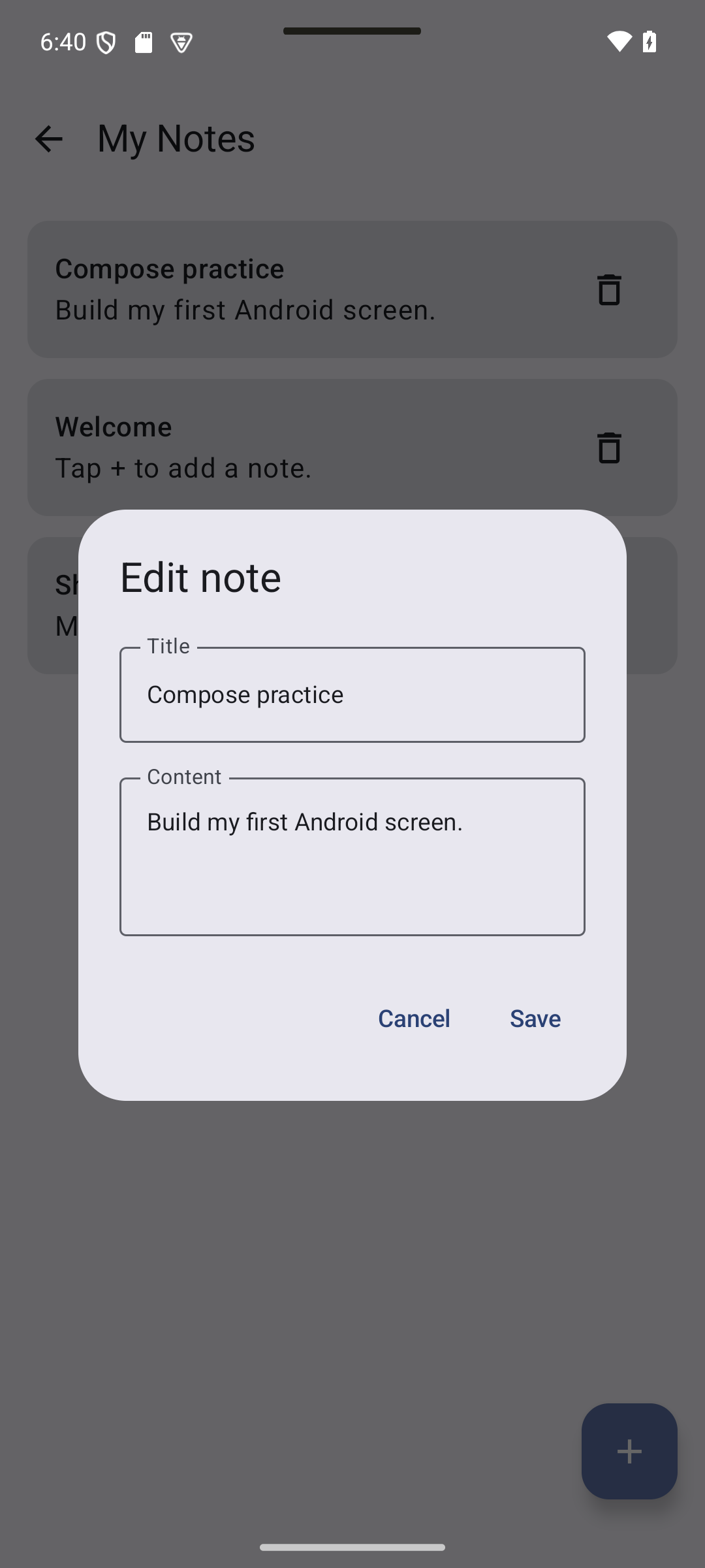
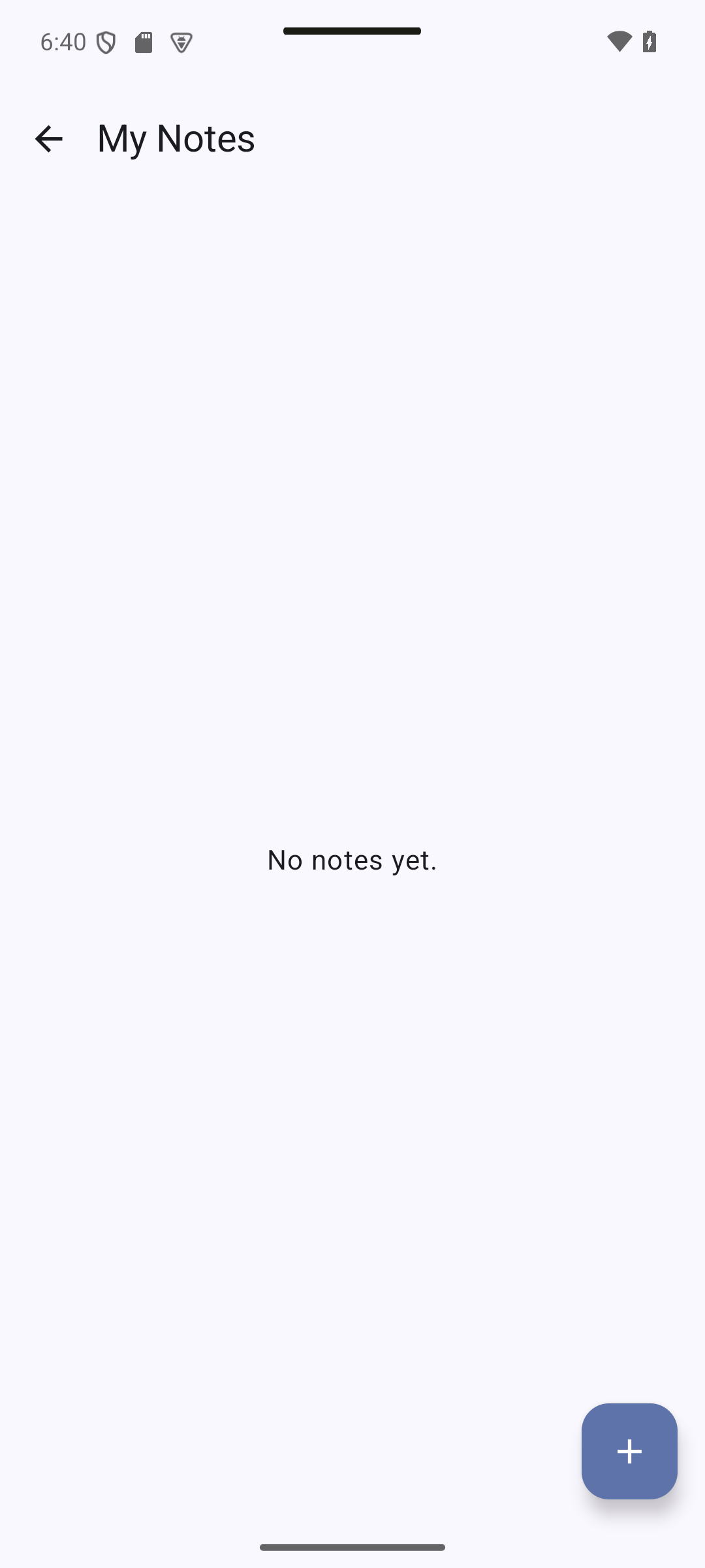
Expected result — native UI preview. Refactoring keeps the same UI. The edit dialog starts with existing values; deleting every note shows No notes yet. Also test rotation to check ViewModel ownership.
Concepts in this section:
- Single responsibility: one composable, one job
- State hoisting: stateless composables receive data and callbacks (data down, events up)
- ViewModel +
StateFlow: the data and the business logic live outside the UI collectAsStateWithLifecycle: turn aStateFlowinto Compose state, only while the screen is visible
Visual guide. Read solid arrows downward for data and dashed arrows upward for user intent.
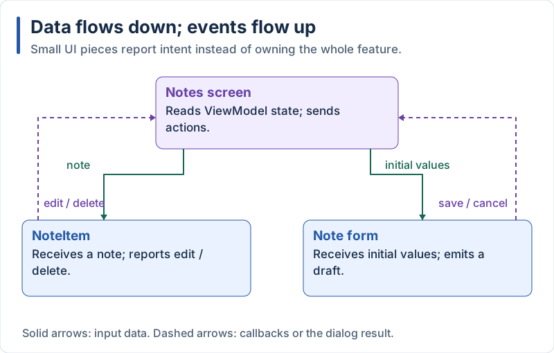
The screen coordinates reusable pieces through input values and callbacks or dialog results.
Visual guide. Compare rotation with owner removal: keeping a ViewModel through one does not imply keeping it through the other.
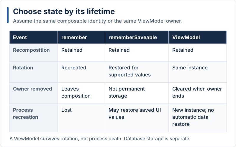
These lifetimes do not replace database persistence.
Extract the card into NoteItem:
// app/src/main/java/com/example/notes/ui/NoteItem.kt
package com.example.notes.ui

import androidx.compose.foundation.layout.Column
import androidx.compose.foundation.layout.Row
import androidx.compose.foundation.layout.fillMaxWidth
import androidx.compose.foundation.layout.padding
import androidx.compose.material.icons.Icons
import androidx.compose.material.icons.outlined.Delete
import androidx.compose.material3.Card
import androidx.compose.material3.Icon
import androidx.compose.material3.IconButton
import androidx.compose.material3.MaterialTheme
import androidx.compose.material3.Text
import androidx.compose.runtime.Composable
import androidx.compose.ui.Alignment
import androidx.compose.ui.Modifier
import androidx.compose.ui.text.style.TextOverflow
import androidx.compose.ui.tooling.preview.Preview
import androidx.compose.ui.unit.dp
import com.example.notes.model.Note
import com.example.notes.ui.theme.NotesTheme

@Composable
fun NoteItem(
    note: Note,
    onEdit: () -> Unit,
    onDelete: () -> Unit,
    modifier: Modifier = Modifier,
) {
    Card(onClick = onEdit, modifier = modifier.fillMaxWidth()) {
        Row(
            modifier = Modifier.padding(16.dp),
            verticalAlignment = Alignment.CenterVertically,
        ) {
            Column(modifier = Modifier.weight(1f)) {
                Text(note.title, style = MaterialTheme.typography.titleMedium)
                Text(note.content, maxLines = 2, overflow = TextOverflow.Ellipsis)
            }
            IconButton(onClick = onDelete) {
                Icon(Icons.Outlined.Delete, contentDescription = "Delete ${note.title}")
            }
        }
    }
}

@Preview
@Composable
private fun NoteItemPreview() {
    NotesTheme {
        NoteItem(Note("1", "Shopping", "Milk, bread, coffee."), onEdit = {}, onDelete = {})
    }
}
Extract the dialog into NoteInputDialog:
// app/src/main/java/com/example/notes/ui/NoteInputDialog.kt
package com.example.notes.ui

import androidx.compose.foundation.layout.Arrangement
import androidx.compose.foundation.layout.Column
import androidx.compose.material3.AlertDialog
import androidx.compose.material3.OutlinedTextField
import androidx.compose.material3.Text
import androidx.compose.material3.TextButton
import androidx.compose.runtime.Composable
import androidx.compose.runtime.getValue
import androidx.compose.runtime.mutableStateOf
import androidx.compose.runtime.saveable.rememberSaveable
import androidx.compose.runtime.setValue
import androidx.compose.ui.unit.dp
import com.example.notes.model.Note
import com.example.notes.model.NoteDraft

/**
 * Form shown in a dialog. [initial] is null when creating a note.
 * It does not know where the note goes: it just returns a [NoteDraft].
 */
@Composable
fun NoteInputDialog(
    initial: Note?,
    onSave: (NoteDraft) -> Unit,
    onDismiss: () -> Unit,
) {
    // The dialog is only composed while it is open, so these values start fresh each time
    var title by rememberSaveable { mutableStateOf(initial?.title.orEmpty()) }
    var content by rememberSaveable { mutableStateOf(initial?.content.orEmpty()) }

    AlertDialog(
        onDismissRequest = onDismiss,
        title = { Text(if (initial == null) "New note" else "Edit note") },
        text = {
            Column(verticalArrangement = Arrangement.spacedBy(12.dp)) {
                OutlinedTextField(
                    value = title,
                    onValueChange = { title = it },
                    label = { Text("Title") },
                    singleLine = true,
                )
                OutlinedTextField(
                    value = content,
                    onValueChange = { content = it },
                    label = { Text("Content") },
                    minLines = 3,
                )
            }
        },
        confirmButton = {
            TextButton(
                enabled = title.isNotBlank(),
                onClick = { onSave(NoteDraft(title.trim(), content.trim())) },
            ) { Text("Save") }
        },
        dismissButton = { TextButton(onClick = onDismiss) { Text("Cancel") } },
    )
}
Move the data and the logic to a ViewModel:
// app/src/main/java/com/example/notes/ui/NotesViewModel.kt
package com.example.notes.ui

import androidx.lifecycle.ViewModel
import com.example.notes.model.Note
import com.example.notes.model.NoteDraft
import java.util.UUID
import kotlinx.coroutines.flow.MutableStateFlow
import kotlinx.coroutines.flow.StateFlow
import kotlinx.coroutines.flow.asStateFlow
import kotlinx.coroutines.flow.update

class NotesViewModel : ViewModel() {

    // Private mutable state, public read-only view
    private val _notes = MutableStateFlow(
        listOf(
            Note("1", "Welcome", "Tap + to add a note."),
            Note("2", "Shopping", "Milk, bread, coffee."),
        ),
    )
    val notes: StateFlow<List<Note>> = _notes.asStateFlow()

    fun add(draft: NoteDraft) {
        val note = Note(UUID.randomUUID().toString(), draft.title, draft.content)
        _notes.update { listOf(note) + it }
    }

    fun update(id: String, draft: NoteDraft) {
        _notes.update { list ->
            list.map { if (it.id == id) it.copy(title = draft.title, content = draft.content) else it }
        }
    }

    fun delete(id: String) {
        _notes.update { list -> list.filterNot { it.id == id } }
    }
}
The screen becomes much shorter:
// app/src/main/java/com/example/notes/ui/NotesScreen.kt
package com.example.notes.ui

import androidx.compose.foundation.layout.Arrangement
import androidx.compose.foundation.layout.Box
import androidx.compose.foundation.layout.PaddingValues
import androidx.compose.foundation.layout.fillMaxSize
import androidx.compose.foundation.layout.padding
import androidx.compose.foundation.lazy.LazyColumn
import androidx.compose.foundation.lazy.items
import androidx.compose.material.icons.Icons
import androidx.compose.material.icons.automirrored.filled.ArrowBack
import androidx.compose.material.icons.filled.Add
import androidx.compose.material3.ExperimentalMaterial3Api
import androidx.compose.material3.FloatingActionButton
import androidx.compose.material3.Icon
import androidx.compose.material3.IconButton
import androidx.compose.material3.Scaffold
import androidx.compose.material3.Text
import androidx.compose.material3.TopAppBar
import androidx.compose.runtime.Composable
import androidx.compose.runtime.getValue
import androidx.compose.runtime.mutableStateOf
import androidx.compose.runtime.saveable.rememberSaveable
import androidx.compose.runtime.setValue
import androidx.compose.ui.Alignment
import androidx.compose.ui.Modifier
import androidx.compose.ui.unit.dp
import androidx.lifecycle.compose.collectAsStateWithLifecycle
import androidx.lifecycle.viewmodel.compose.viewModel

@OptIn(ExperimentalMaterial3Api::class)
@Composable
fun NotesScreen(
    onBack: () -> Unit,
    viewModel: NotesViewModel = viewModel(),
) {
    val notes by viewModel.notes.collectAsStateWithLifecycle()

    // UI-only state: is the dialog open, and for which note?
    var dialogOpen by rememberSaveable { mutableStateOf(false) }
    var editingId by rememberSaveable { mutableStateOf<String?>(null) }
    val editing = notes.find { it.id == editingId }

    Scaffold(
        topBar = {
            TopAppBar(
                title = { Text("My Notes") },
                navigationIcon = {
                    IconButton(onClick = onBack) {
                        Icon(Icons.AutoMirrored.Filled.ArrowBack, contentDescription = "Back")
                    }
                },
            )
        },
        floatingActionButton = {
            FloatingActionButton(
                onClick = {
                    editingId = null
                    dialogOpen = true
                },
            ) {
                Icon(Icons.Filled.Add, contentDescription = "Add note")
            }
        },
    ) { innerPadding ->
        if (notes.isEmpty()) {
            Box(Modifier.fillMaxSize().padding(innerPadding), contentAlignment = Alignment.Center) {
                Text("No notes yet.")
            }
        } else {
            LazyColumn(
                modifier = Modifier.fillMaxSize().padding(innerPadding),
                contentPadding = PaddingValues(16.dp),
                verticalArrangement = Arrangement.spacedBy(12.dp),
            ) {
                items(notes, key = { it.id }) { note ->
                    NoteItem(
                        note = note,
                        onEdit = {
                            editingId = note.id
                            dialogOpen = true
                        },
                        onDelete = { viewModel.delete(note.id) },
                    )
                }
            }
        }
    }

    if (dialogOpen) {
        NoteInputDialog(
            initial = editing,
            onSave = { draft ->
                val id = editingId
                if (id == null) viewModel.add(draft) else viewModel.update(id, draft)
                dialogOpen = false
            },
            onDismiss = { dialogOpen = false },
        )
    }
}
Explanation:
NoteItemandNoteInputDialogare stateless (apart from the text being typed): they receive data and callbacks. They can be previewed and reused anywhere- The ViewModel owns the list.
viewModel()returns the same instance after a rotation, so the notes survive configuration changes (a plainrememberwould lose them) MutableStateFlowis an observable holder of the current value. We expose it as a read-onlyStateFlow; only the ViewModel can change it.update { ... }modifies it safelycollectAsStateWithLifecycle()collects the flow only while the screen is at leastSTARTED(visible) and exposes it as Compose state. Always prefer it tocollectAsState()on Android- Unidirectional data flow: the state goes down (
viewModel.notes→ screen →NoteItem) and events go up (onDelete→viewModel.delete). The UI never changes the data directly - The dialog is UI-only state (open / closed), so it stays in the screen with
rememberSaveable; the business data is in the ViewModel. This split is a standard Android architecture rule - Run the app: add, edit and delete notes, rotate the emulator, and check the notes and the open dialog survive
Compose vs React Native vs Flutter Comparison
Expected result — native UI preview. The same screen combines Scaffold, LazyColumn, Card and a floating action button.
Visual guide. Review the rendering overview and the data-flow diagram while comparing the framework names below.
| Concept | React Native (Expo) | Flutter | Kotlin + Compose |
|---|---|---|---|
| Project creation | npx create-expo-app |
flutter create |
Android Studio Empty Activity |
| Language | TypeScript | Dart | Kotlin |
| UI building block | Component (function returning JSX) | Widget (class with build) |
@Composable function |
| Layout | Flexbox (View + style) |
Row, Column, Expanded |
Row, Column, Box, Modifier.weight |
| Styling | StyleSheet.create |
Widget properties, BoxDecoration |
Parameters + Modifier chain, MaterialTheme |
| Long lists | FlatList |
ListView.builder |
LazyColumn |
| Local state | useState |
StatefulWidget + setState |
remember { mutableStateOf() } |
| State that survives rotation | not an issue (no rotation reset) | not an issue | rememberSaveable, ViewModel |
| List keys | keyExtractor |
ValueKey |
items(list, key = { it.id }) |
| Navigation | Expo Router (files) | go_router (route list) |
Navigation 3 (back stack = list of keys) |
| Dialog | Modal |
showDialog + AlertDialog |
AlertDialog shown with an if |
| Passing data down | Props | Constructor parameters | Function parameters |
| Sending events up | Callback props | VoidCallback |
Lambda parameters (onSave: (NoteDraft) -> Unit) |
| Business logic | Reducer / hooks | ChangeNotifier, Riverpod… |
ViewModel + StateFlow |
| Live preview | Fast Refresh | Hot Reload | @Preview + Live Edit |
In Part 2 we replace the in-memory list with a real database.
By Wahid Hamdi