Cross-Platform Mobile App Development Tutorial (React Native and Flutter Side by Side) - Part 1
This is a comprehensive tutorial that teaches both React Native and Flutter side by side. We will build the same app (a Notes app) in both frameworks, so you can compare how each one solves the same problem. The tutorial is split in three parts:
- Part 1 (this file): fundamentals and a local Notes app
- Part 2: connecting the app to a database (Appwrite)
- Part 3: authentication, per-user data and publishing
Versions used in this tutorial (checked in October 2026). Newer minor versions should work, but if something breaks, come back to this table first.
Tool Version Node.js 24 LTS Expo SDK 57 (React Native 0.86, React 19.2, TypeScript) Expo Router 57 Flutter / Dart 3.47 / 3.13 go_router 18
Visual guide. Use this map to locate the current part before starting the examples.
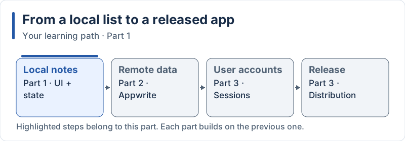
The highlighted steps are developed in this part.
Table of Contents
- Introduction to React Native and Flutter
- Development Environment Setup
- Project Structure and Fundamentals
- UI Components and Styling
- Building the Notes App
- React Native vs Flutter Comparison
Parts 2 and 3 continue with: 6. Database Integration with Appwrite, 7. Authentication, 8. Filtering User Notes, 9. Empty State, 10. Building & Publishing.
1. Introduction to React Native and Flutter
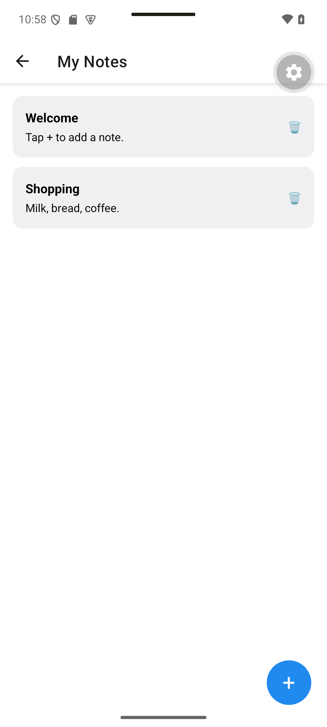
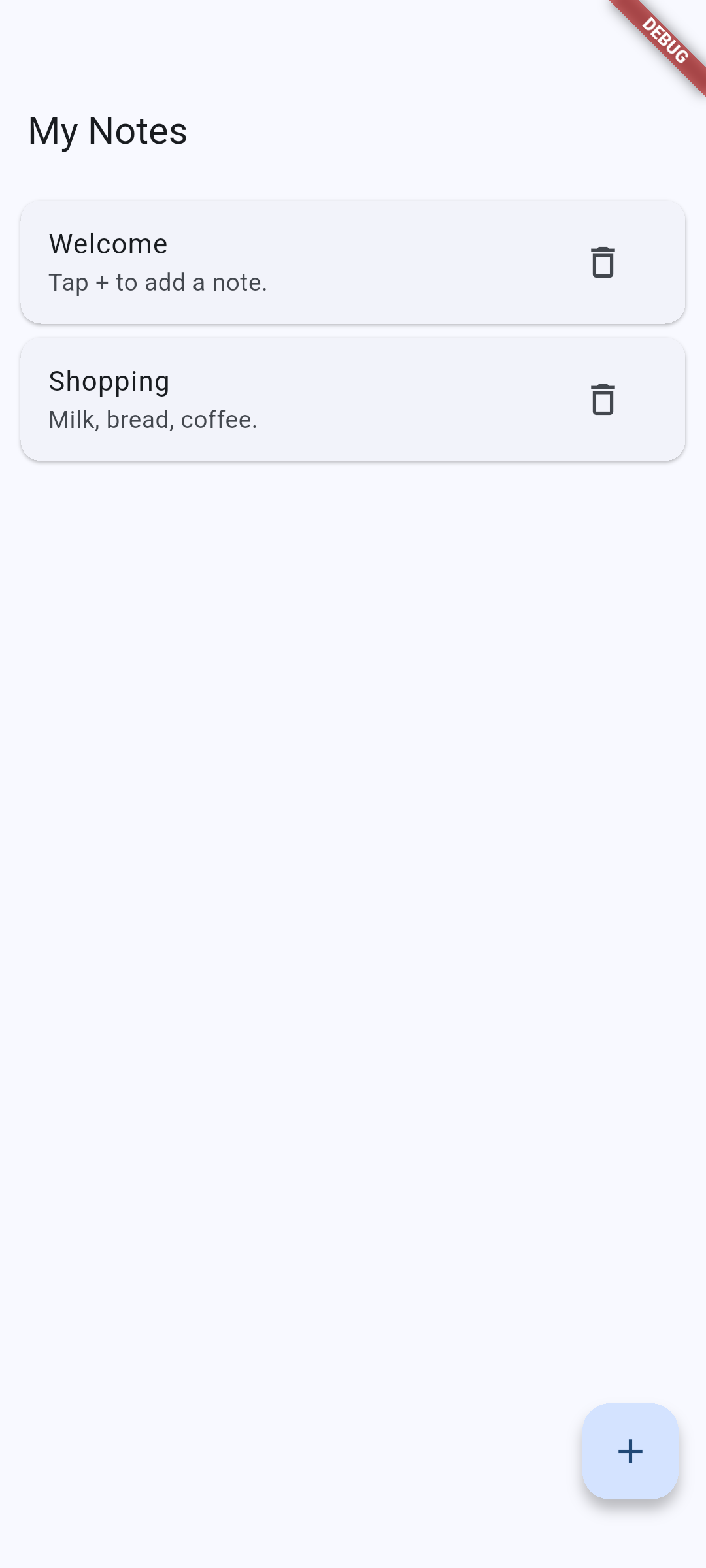
Expected result. The local Notes app below is the result of Part 1. These are real Android captures of the tutorial code; typography and controls differ between frameworks.
Two initial notes: Welcome and Shopping.
| React Native · Android | Flutter · Android |
|---|---|
|
|
Concepts in this section:
- What “cross-platform” means: one code base, several targets (Android, iOS, web)
- Two strategies: native components driven from JavaScript (React Native) vs. own rendering engine (Flutter)
- How to compare frameworks: language, rendering, ecosystem, learning curve
Visual guide. Follow each row from the source language to the visible interface.
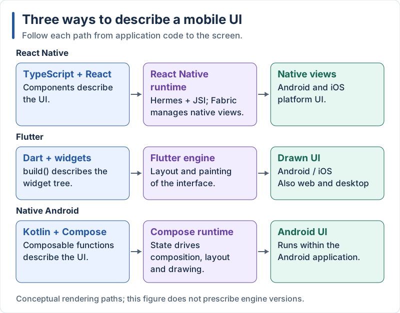
The three approaches share declarative UI ideas, but use different rendering paths.
React Native Overview
React Native is a JavaScript framework created by Meta that allows developers to build native mobile applications using React. It enables writing code once and deploying to both iOS and Android.
Key Characteristics of React Native:
- Uses JavaScript/TypeScript as the primary language
- Leverages the React component model (components, props, state, hooks)
- Renders real native views (not a WebView)
- Large ecosystem of third-party libraries, installed with npm
- Fast Refresh for quick feedback while coding
- Recommended way to start a project today: Expo (a framework and set of tools built on top of React Native)
Architecture: Modern React Native runs your JavaScript on the Hermes engine. The old asynchronous “bridge” has been replaced by the New Architecture: JSI lets JavaScript call native code directly and synchronously, and Fabric is the new rendering system that creates the native views. As of the version used here, the New Architecture is the only one available, so you do not have to enable anything.
Flutter Overview
Flutter is a UI toolkit created by Google that allows developers to build natively compiled applications for mobile, web and desktop from a single code base.
Key Characteristics of Flutter:
- Uses Dart as the primary language (compiled ahead of time to native code)
- Everything is a widget (similar to components in React)
- Draws every pixel itself instead of using native views
- Packages are installed with
pub(https://pub.dev) - Stateful Hot Reload for quick feedback while coding
- Backed by Google
Architecture: Flutter does not rely on native components. It draws the UI with its own rendering engine, Impeller, which replaced Skia and precompiles shaders to avoid stutter at runtime. This gives Flutter precise control over every pixel and a very consistent look across platforms.
Comparison Between React Native and Flutter
| Aspect | React Native | Flutter |
|---|---|---|
| Language | JavaScript / TypeScript | Dart |
| UI | Real native views (Fabric) | Custom rendering engine (Impeller) |
| JS ↔ native | JSI (synchronous, no bridge) | Not needed (compiled Dart) |
| Development experience | Fast Refresh | Stateful Hot Reload |
| Learning curve | Easy if you know React | New language and widget model to learn |
| Ecosystem | npm, very large | pub.dev, large and well curated |
| Backed by | Meta (+ Expo, Microsoft, Software Mansion…) |
2. Development Environment Setup
Expected result. After creating the project, run it on Android. The generator screen depends on the template version; after applying section 3, compare your result with the Hello captures below.
Concepts in this section:
- Toolchain: runtime/SDK, package manager, emulator or physical device
- Project generators (
create-expo-app,flutter create) - Health-check commands (
expo-doctor,flutter doctor)
Visual guide. Follow the toolchain from setup to a visible result on the device.
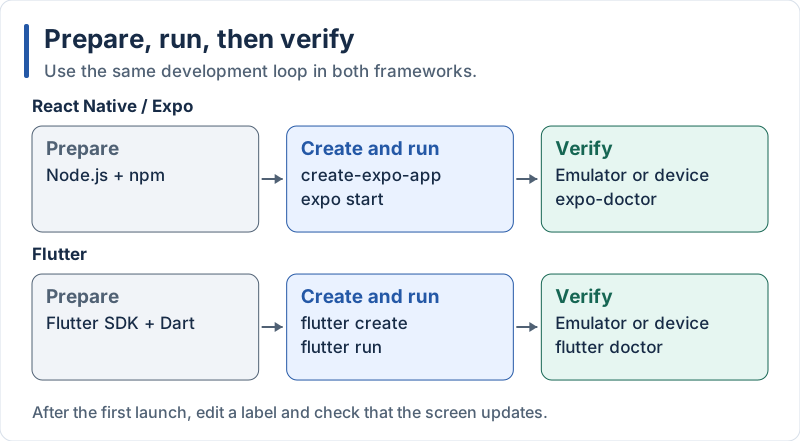
Checkpoint: launch the starter app, edit a label, and verify the change.
Setting Up React Native with Expo
Expo provides the project template, the development server, the router and the cloud build service (EAS, used in Part 3).
Steps:
-
Install Node.js (LTS) and npm: Download and install from https://nodejs.org/
-
Create a new project (no global CLI to install: the old
expo-cli/expo initare no longer used):npx create-expo-app@latest notes-app -
Navigate to the project directory:
cd notes-app -
Start the development server:
npx expo startThen press
a(Android emulator),i(iOS simulator, macOS only) orw(browser), or scan the QR code with the Expo Go app on your phone. -
Check the project health (optional but useful when something looks wrong):
npx expo-doctor
Setting Up Flutter
Steps:
-
Download the Flutter SDK: Visit https://docs.flutter.dev/get-started/install and follow the instructions for your operating system (the installer also sets up Android tooling).
-
Add Flutter to your PATH: Follow the OS-specific instructions from the Flutter website.
-
Run flutter doctor:
flutter doctorAddress any issues identified by the command (Android SDK licenses, Xcode on macOS, …).
-
Create a new project:
flutter create notes_app -
Navigate to the project directory:
cd notes_app -
Start the app:
flutter run(Make sure you have an emulator running or a device connected, or use
flutter run -d chrome.)
3. Project Structure and Fundamentals
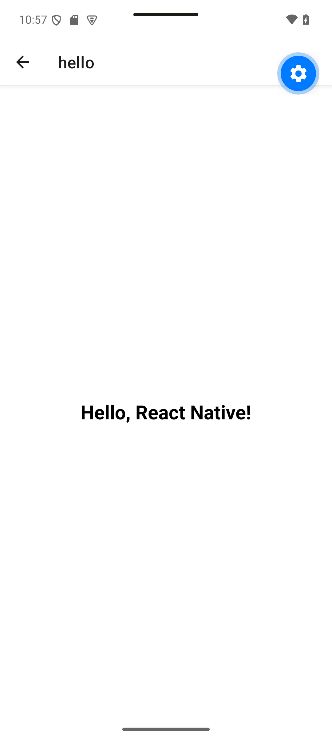
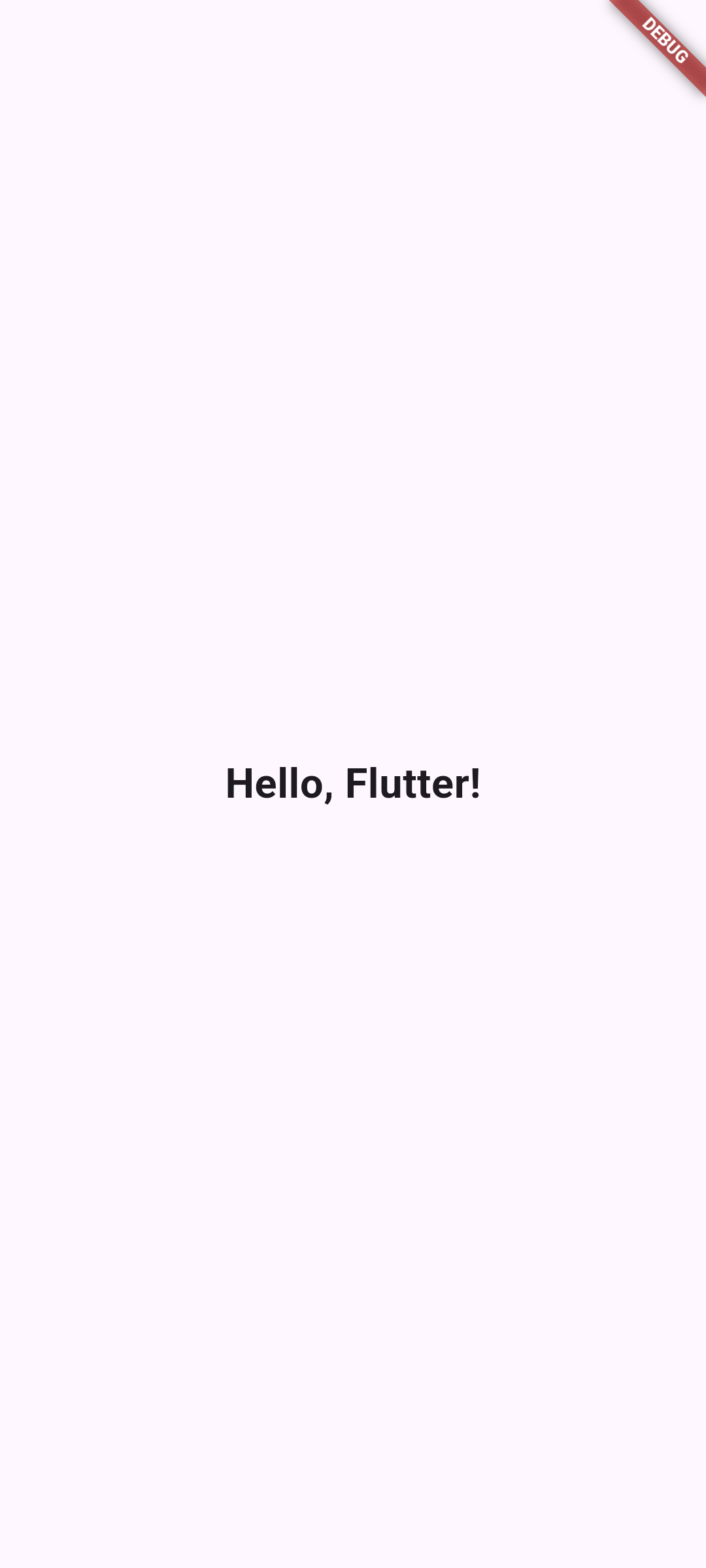
Expected result. A centered greeting confirms that the entry screen is running.
| React Native · Android | Flutter · Android |
|---|---|
|
|
Concepts in this section:
- Anatomy of a generated project
- The component / widget as the basic building block
- File-based routing in Expo Router: a file in
src/appis a screen - Entry points:
src/app/index.tsx(React Native) andlib/main.dart(Flutter)
Visual guide. Trace the entry path before reading the generated files.
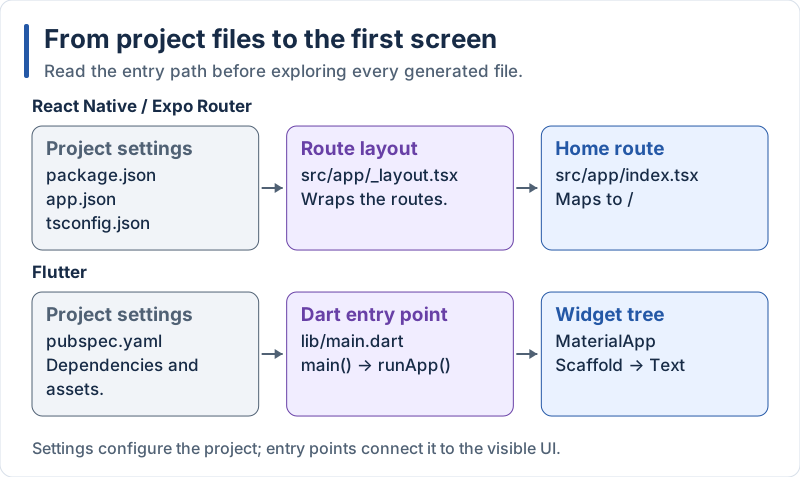
Configuration supports the project; the entry path leads to the first screen.
React Native Project Structure
notes-app/
├── src/
│   └── app/            // Screens: each file is a route
│       ├── _layout.tsx // Root layout (navigation container)
│       └── index.tsx   // Route "/"
├── assets/             // Static assets like images
├── app.json            // Expo configuration
├── package.json        // Project metadata and dependencies
└── tsconfig.json       // TypeScript configuration
The generated project contains a demo app. Remove it with the provided script, which moves the starter code to a separate folder and leaves a minimal src/app:
npm run reset-projectThen replace the content of src/app/index.tsx:
src/app/index.tsx (React Native):
import { StyleSheet, Text, View } from 'react-native';

export default function Index() {
  return (
    <View style={styles.container}>
      <Text style={styles.text}>Hello, React Native!</Text>
    </View>
  );
}

const styles = StyleSheet.create({
  container: {
    flex: 1,
    backgroundColor: '#fff',
    alignItems: 'center',
    justifyContent: 'center',
  },
  text: {
    fontSize: 24,
    fontWeight: 'bold',
  },
});
Explanation:
- We import core components from React Native:
View(similar todivon the web) andText StyleSheet.createdefines styles (similar to CSS but in JavaScript objects, with camelCase names)- The default export of a file in
src/appis the screen displayed for that route - The file is TypeScript (
.tsx): TypeScript is the default in Expo templates
Flutter Project Structure
notes_app/
├── lib/            // Source code
│   └── main.dart   // Main entry point
├── pubspec.yaml    // Project configuration and dependencies
├── android/        // Android-specific code
├── ios/            // iOS-specific code
├── web/            // Web-specific code
└── test/           // Test files
Replace the content of lib/main.dart:
lib/main.dart (Flutter):
import 'package:flutter/material.dart';

void main() {
  runApp(const MyApp());
}

class MyApp extends StatelessWidget {
  const MyApp({super.key});

  @override
  Widget build(BuildContext context) {
    return const MaterialApp(
      home: Scaffold(
        body: Center(
          child: Text(
            'Hello, Flutter!',
            style: TextStyle(fontSize: 24, fontWeight: FontWeight.bold),
          ),
        ),
      ),
    );
  }
}
Explanation:
- We import
material.dartwhich provides Material Design widgets main()is the entry point that runs our appMyAppis aStatelessWidget: it has no internal state and just describes the UI inbuildconstconstructors let Flutter reuse widgets instead of rebuilding themsuper.keyis the modern way to forward thekeyparameter to the parent classMaterialAppis the root widget providing the Material Design look and feelScaffoldprovides the basic page structure,Centercenters its child,Textdisplays text
4. UI Components and Styling
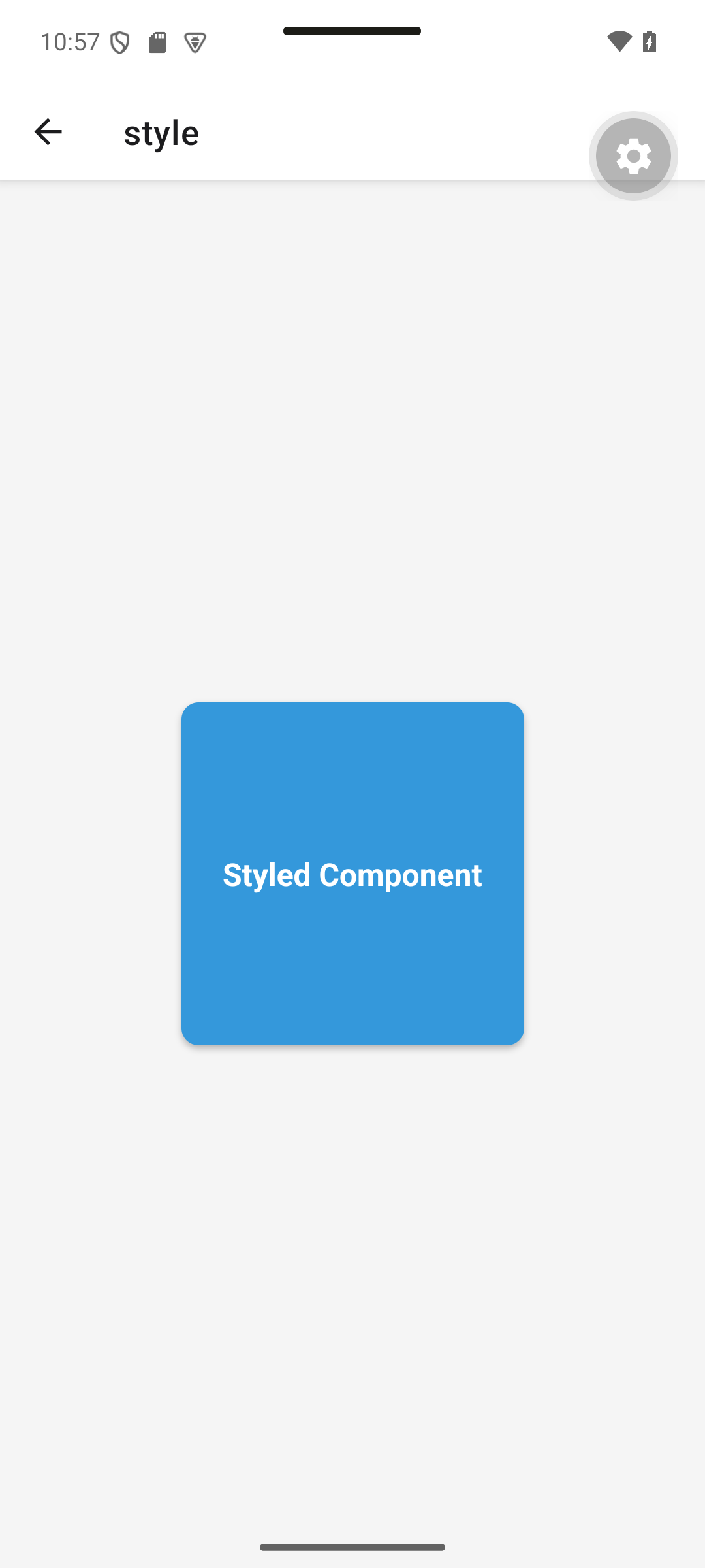
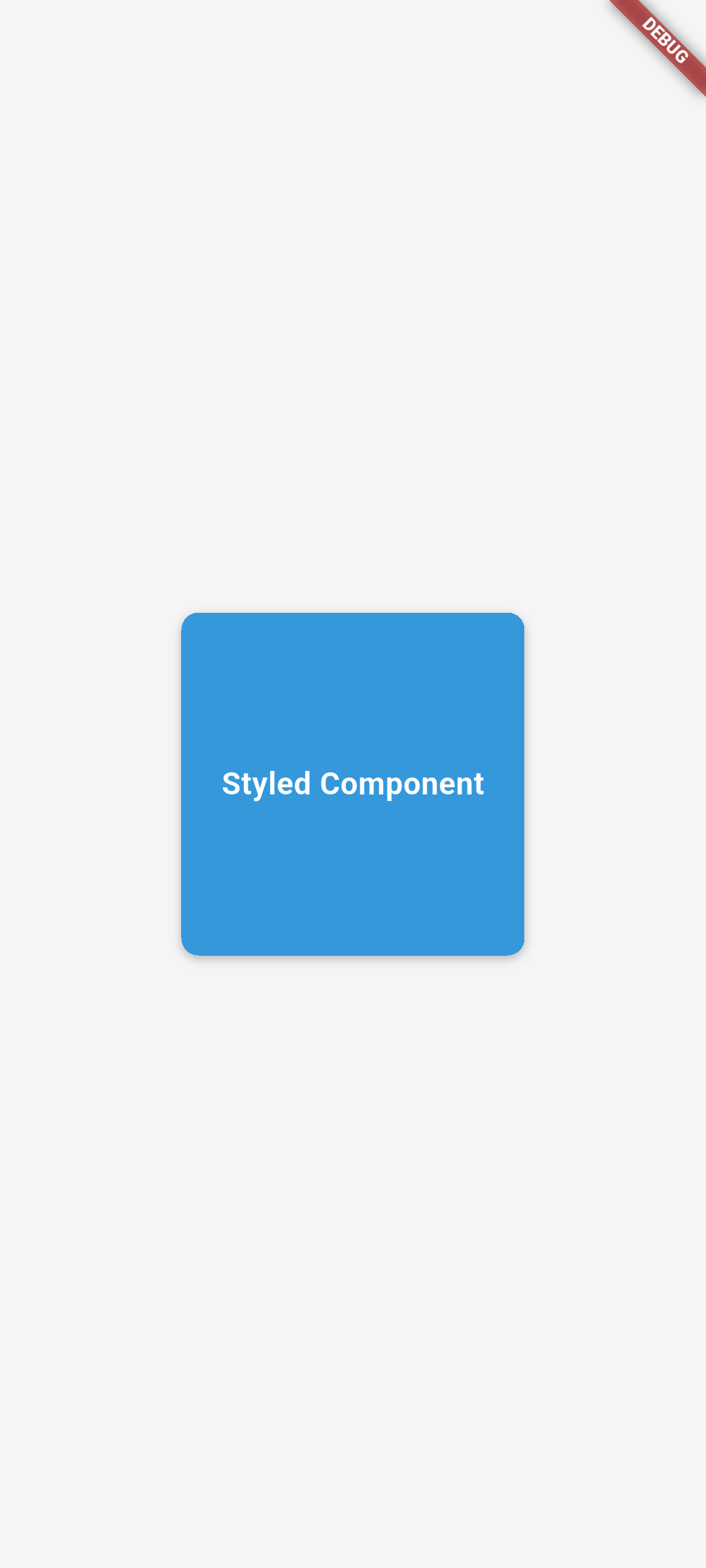
Expected result. A blue square with rounded corners, a shadow and centered white text.
| React Native · Android | Flutter · Android |
|---|---|
|
|
Concepts in this section:
- Core building blocks: containers, text, images, inputs, scrollable lists
- Styling:
StyleSheetobjects (React Native) vs. properties/decorations on widgets (Flutter) - Layout: Flexbox (React Native) vs.
Row/Column/Expanded(Flutter)
Visual guide. Match each region of this schematic screen to a component name.
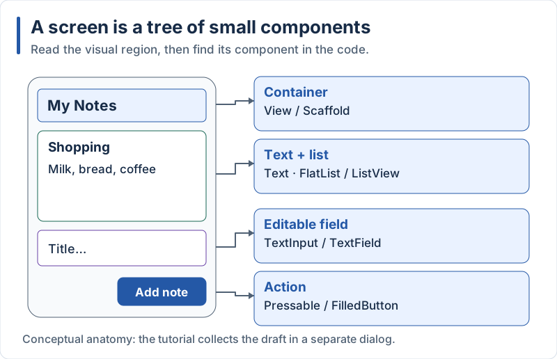
The form is shown inside the screen only to label its parts; the code opens it in a dialog.
React Native Components and Styling
React Native provides a set of core components that map to native UI elements:
View: A container (likedivon the web)Text: For displaying text (all text must be inside it)Image: For displaying imagesTextInput: For text inputScrollView: For scrollable contentFlatList: For efficient rendering of long listsPressable: For touchable elements (it replaces the olderTouchableOpacity)
Styling Example:
import { StyleSheet, Text, View } from 'react-native';

export default function StyleDemo() {
  return (
    <View style={styles.container}>
      <View style={styles.box}>
        <Text style={styles.text}>Styled Component</Text>
      </View>
    </View>
  );
}

const styles = StyleSheet.create({
  container: {
    flex: 1,
    alignItems: 'center',
    justifyContent: 'center',
    backgroundColor: '#f5f5f5',
  },
  box: {
    width: 200,
    height: 200,
    backgroundColor: '#3498db',
    borderRadius: 10,
    alignItems: 'center',
    justifyContent: 'center',
    // Cross-platform shadow (works on iOS, Android and web)
    boxShadow: '0 2px 4px rgba(0, 0, 0, 0.25)',
  },
  text: {
    color: 'white',
    fontSize: 18,
    fontWeight: 'bold',
  },
});
Explanation:
- Styles are similar to CSS but use camelCase (
backgroundColorinstead ofbackground-color) flex: 1makes the container take up all available spacealignItemsandjustifyContentcontrol the positioning of childrenboxShadowis now supported by the New Architecture, so you no longer need theshadow*properties for iOS pluselevationfor Android
Flutter Widgets and Styling
Flutter uses widgets for everything in the UI:
Container: A box that can have size, color, padding and decorationText: For displaying textImage: For displaying imagesTextField: For text inputSingleChildScrollView: Similar toScrollViewListView: Similar toFlatList(ListView.builderrenders lazily)InkWell/GestureDetector: For detecting taps and gestures
Styling Example:
import 'package:flutter/material.dart';

class StyleDemo extends StatelessWidget {
  const StyleDemo({super.key});

  @override
  Widget build(BuildContext context) {
    return Scaffold(
      backgroundColor: const Color(0xFFF5F5F5),
      body: Center(
        child: Container(
          width: 200,
          height: 200,
          decoration: BoxDecoration(
            color: const Color(0xFF3498DB),
            borderRadius: BorderRadius.circular(10),
            boxShadow: [
              BoxShadow(
                // withValues(alpha:) replaces the deprecated withOpacity()
                color: Colors.black.withValues(alpha: 0.25),
                blurRadius: 4,
                offset: const Offset(0, 2),
              ),
            ],
          ),
          child: const Center(
            child: Text(
              'Styled Component',
              style: TextStyle(
                color: Colors.white,
                fontSize: 18,
                fontWeight: FontWeight.bold,
              ),
            ),
          ),
        ),
      ),
    );
  }
}
Explanation:
Containeris a box model similar toViewin React Native- Styling is applied directly on widgets or through the
decorationproperty BoxDecorationprovides background color, border radius, shadows…- Flutter has no separate stylesheet: the style is part of the widget tree
Color.withValues(alpha: ...)replaceswithOpacity, which is deprecated
Layout in React Native and Flutter
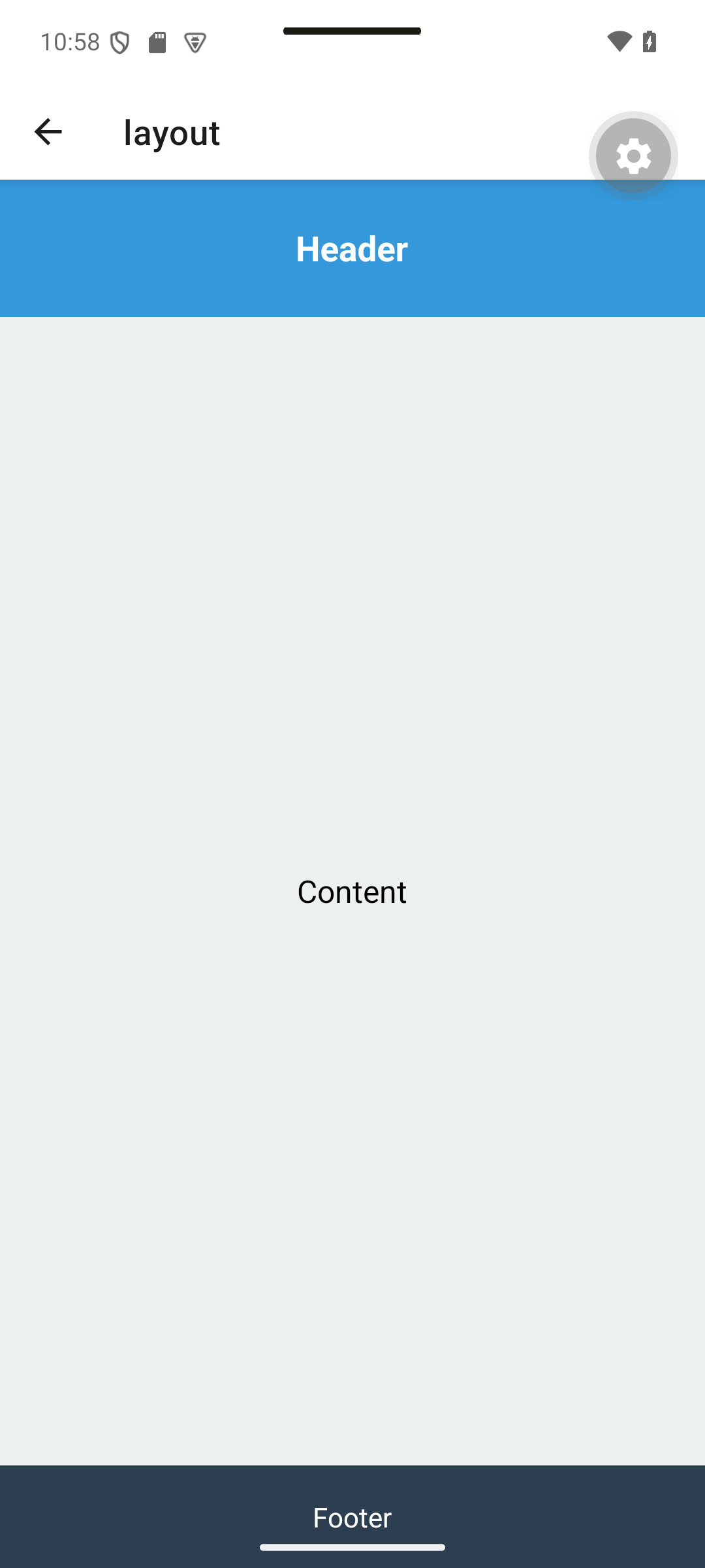
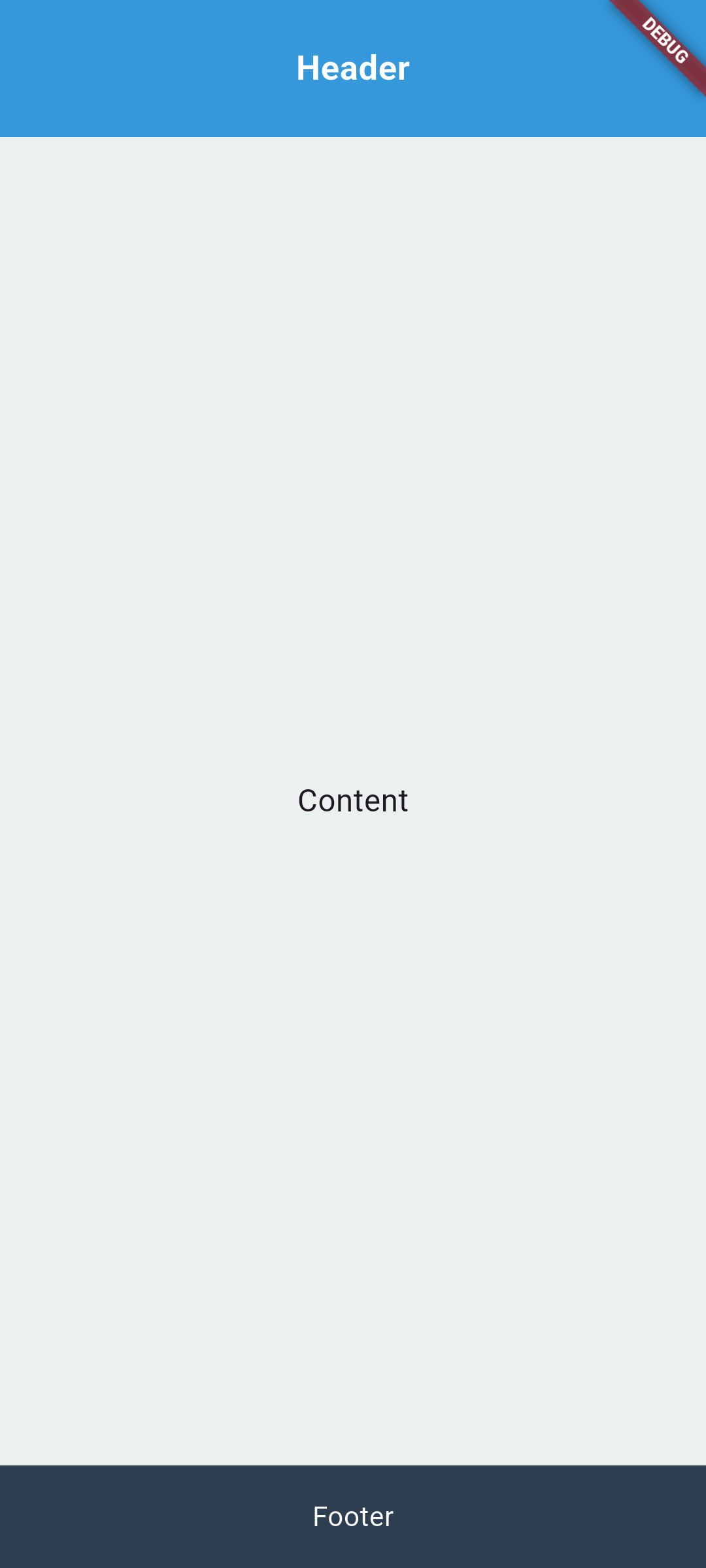
Expected result. The header and footer keep their height while Content fills the remaining space.
| React Native · Android | Flutter · Android |
|---|---|
|
|
Visual guide. First identify the main axis, then find the child that receives the remaining space.
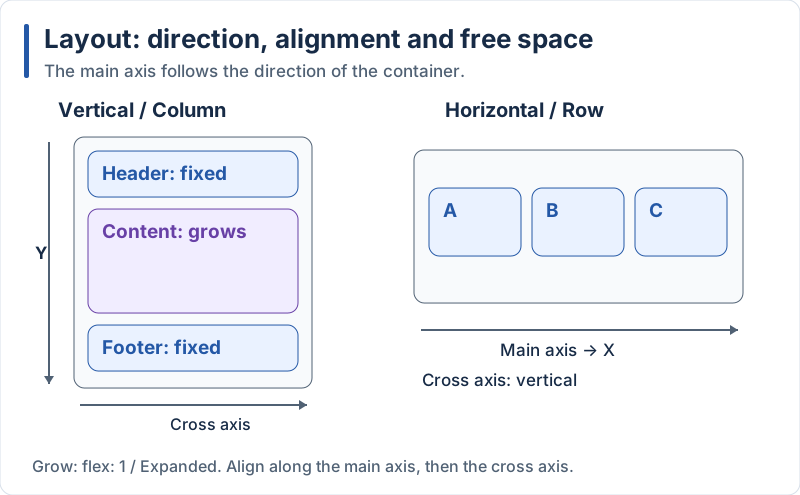
Header and footer keep their size while the content area grows.
React Native Layout
React Native uses Flexbox for layout. The main axis is vertical by default (flexDirection: 'column'):
import { StyleSheet, Text, View } from 'react-native';

export default function LayoutDemo() {
  return (
    <View style={styles.container}>
      <View style={styles.header}>
        <Text style={styles.headerText}>Header</Text>
      </View>
      <View style={styles.content}>
        <Text style={styles.contentText}>Content</Text>
      </View>
      <View style={styles.footer}>
        <Text style={styles.footerText}>Footer</Text>
      </View>
    </View>
  );
}

const styles = StyleSheet.create({
  container: {
    flex: 1,
    flexDirection: 'column',
  },
  header: {
    height: 80,
    backgroundColor: '#3498db',
    justifyContent: 'center',
    alignItems: 'center',
  },
  headerText: {
    color: 'white',
    fontSize: 20,
    fontWeight: 'bold',
  },
  content: {
    flex: 1,
    backgroundColor: '#ecf0f1',
    justifyContent: 'center',
    alignItems: 'center',
  },
  contentText: {
    fontSize: 18,
  },
  footer: {
    height: 60,
    backgroundColor: '#2c3e50',
    justifyContent: 'center',
    alignItems: 'center',
  },
  footerText: {
    color: 'white',
    fontSize: 16,
  },
});
Explanation:
flex: 1makes the container take all available spaceflexDirection: 'column'stacks children vertically (this is the default)- The header and footer have fixed heights
- The content area grows to fill the remaining space with
flex: 1
Flutter Layout
Flutter offers dedicated layout widgets instead of a single flexbox model:
import 'package:flutter/material.dart';

class LayoutDemo extends StatelessWidget {
  const LayoutDemo({super.key});

  @override
  Widget build(BuildContext context) {
    return Scaffold(
      body: Column(
        children: [
          Container(
            height: 80,
            color: const Color(0xFF3498DB),
            alignment: Alignment.center,
            child: const Text(
              'Header',
              style: TextStyle(
                color: Colors.white,
                fontSize: 20,
                fontWeight: FontWeight.bold,
              ),
            ),
          ),
          Expanded(
            child: Container(
              color: const Color(0xFFECF0F1),
              alignment: Alignment.center,
              child: const Text('Content', style: TextStyle(fontSize: 18)),
            ),
          ),
          Container(
            height: 60,
            color: const Color(0xFF2C3E50),
            alignment: Alignment.center,
            child: const Text(
              'Footer',
              style: TextStyle(color: Colors.white, fontSize: 16),
            ),
          ),
        ],
      ),
    );
  }
}
Explanation:
Columnarranges children vertically (Rowdoes it horizontally)Expandedmakes its child take all the remaining space (similar toflex: 1)Containerwithalignmentcenters its child without an extraCenterwidgetColumnandRowalso acceptspacing:to add a gap between children (similar togapin React Native)
5. Building the Notes App
Expected result. Work through sections 5.1–5.4 to reach the local list shown in section 1. No database or account is involved yet.
Concepts in this section:
- Routing: describing the screens of the app and moving between them
- Local state: data owned by a screen that triggers a re-render when it changes (
useState/setState) - Lists: rendering collections efficiently (
FlatList/ListView.builder) with stable keys - Modal input: collecting data in a dialog and returning it to the caller
- Refactoring: splitting a big screen into small, reusable components/widgets
Our Notes app will have a home screen and a notes screen where the user can create, edit and delete notes. For now notes live in memory only: they disappear when the app restarts (we fix that in Part 2).
5.1 Setting up Navigation
Expected result. After implementing Home and Notes in sections 5.2–5.3, tapping Open my notes changes the visible screen from the Home capture to the Notes capture. Flutter uses context.go here, so it does not add the same back stack as the React Native Link.
Visual guide. Read the stack from left to right and identify which screen is visible after each action.
![Expo Router: Link / push, then Back: Home — Stack: [Home] → Open notes — Stack: [Home, Notes] → Back — Stack: [Home]; Flutter: context.go in this tutorial: Home — Location: / → go(’/notes’) — Stack: [Notes] → go(’/’) — Stack: [Home]; Flutter alternative: push / pop: push(’/notes’) — Adds Notes above Home. → pop() — Removes Notes to reveal Home.](/mobile-dev/svg/cross-platform/navigation.svg)
Navigation state determines the visible screen; the examples below provide the exact API calls.
React Native Navigation with Expo Router
Expo Router is built on top of React Navigation. You do not install navigation packages by hand: they are part of the template. A route is simply a file.
Create the following structure:
notes-app/
└── src/
    ├── app/
    │   ├── _layout.tsx   // Navigation stack
    │   ├── index.tsx     // "/"        -> Home
    │   └── notes.tsx     // "/notes"   -> Notes
    ├── components/
    │   ├── NoteItem.tsx
    │   └── NoteInputModal.tsx
    └── types.ts
// src/app/_layout.tsx
import { Stack } from 'expo-router';
export default function RootLayout() {
return (
<Stack>
<Stack.Screen name="index" options={{ title: 'Notes App' }} />
<Stack.Screen name="notes" options={{ title: 'My Notes' }} />
</Stack>
);
}Explanation:
_layout.tsxwraps all screens of the folder: here it declares a stack (screens pushed on top of each other with a back button)namematches the file name without extensionoptionsconfigures the header of each screen- Navigating is done with
<Link href="/notes">orrouter.push('/notes')
Flutter Navigation with go_router
go_router is the package recommended by the Flutter team for declarative routing (it also works with deep links and the browser URL on web). Add it:
flutter pub add go_routerCreate the following structure:
notes_app/
└── lib/
    ├── main.dart
    ├── models/
    │   └── note.dart
    ├── screens/
    │   ├── home_screen.dart
    │   └── notes_screen.dart
    └── widgets/
        ├── note_item.dart
        └── note_input_dialog.dart
// lib/main.dart
import 'package:flutter/material.dart';
import 'package:go_router/go_router.dart';
import 'screens/home_screen.dart';
import 'screens/notes_screen.dart';
void main() => runApp(const NotesApp());
final _router = GoRouter(
routes: [
GoRoute(path: '/', builder: (context, state) => const HomeScreen()),
GoRoute(path: '/notes', builder: (context, state) => const NotesScreen()),
],
);
class NotesApp extends StatelessWidget {
const NotesApp({super.key});
@override
Widget build(BuildContext context) {
return MaterialApp.router(
title: 'Notes App',
theme: ThemeData(colorSchemeSeed: const Color(0xFF208AEF)),
darkTheme: ThemeData(
colorSchemeSeed: const Color(0xFF208AEF),
brightness: Brightness.dark,
),
routerConfig: _router,
);
}
}Explanation:
GoRouterholds the list of routes; eachGoRoutemaps a path to a widgetMaterialApp.routerplugs the router into the appcolorSchemeSeedgenerates a complete, accessible Material 3 color scheme from a single color- Providing
darkThememakes the app follow the system dark mode automatically - Navigating is done with
context.go('/notes')(replace the stack) orcontext.push('/notes')(add to the stack)
5.2 Home Screen
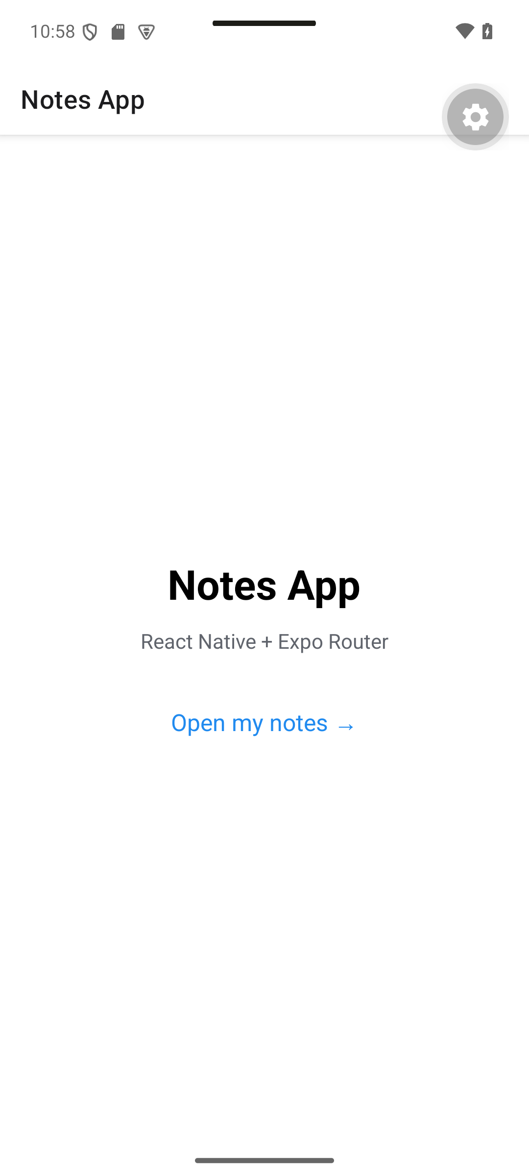
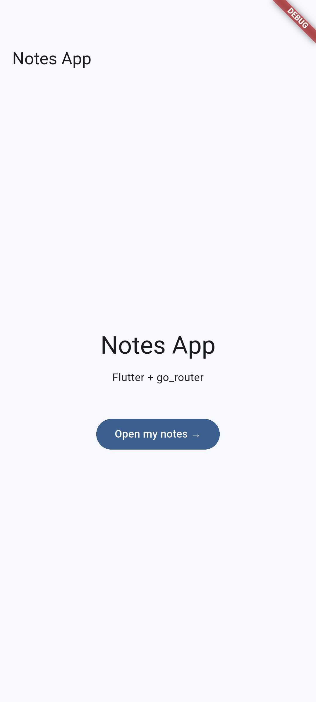
Expected result. The Home screen offers one action: Open my notes.
| React Native · Android | Flutter · Android |
|---|---|
|
|
Visual guide. Use the navigation diagram in section 5.1: the Home button opens the Notes destination.
React Native Home Screen
// src/app/index.tsx
import { Link } from 'expo-router';
import { StyleSheet, Text, View } from 'react-native';

export default function HomeScreen() {
  return (
    <View style={styles.container}>
      <Text style={styles.title}>Notes App</Text>
      <Text style={styles.subtitle}>React Native + Expo Router</Text>

      <Link href="/notes" style={styles.link}>
        Open my notes →
      </Link>
    </View>
  );
}

const styles = StyleSheet.create({
  container: {
    flex: 1,
    alignItems: 'center',
    justifyContent: 'center',
    gap: 12,
    backgroundColor: '#fff',
  },
  title: { fontSize: 32, fontWeight: 'bold' },
  subtitle: { fontSize: 16, color: '#60646c' },
  link: {
    marginTop: 16,
    padding: 12,
    fontSize: 18,
    color: '#208AEF',
  },
});
Explanation:
Linkis the declarative way to navigate; it renders aText, so it accepts text stylesgapadds space between the children of a flex container
Flutter Home Screen
// lib/screens/home_screen.dart
import 'package:flutter/material.dart';
import 'package:go_router/go_router.dart';

class HomeScreen extends StatelessWidget {
  const HomeScreen({super.key});

  @override
  Widget build(BuildContext context) {
    final textTheme = Theme.of(context).textTheme;

    return Scaffold(
      appBar: AppBar(title: const Text('Notes App')),
      body: Center(
        child: Column(
          mainAxisSize: MainAxisSize.min,
          spacing: 12,
          children: [
            Text('Notes App', style: textTheme.headlineLarge),
            const Text('Flutter + go_router'),
            const SizedBox(height: 16),
            FilledButton(
              onPressed: () => context.go('/notes'),
              child: const Text('Open my notes →'),
            ),
          ],
        ),
      ),
    );
  }
}
Explanation:
Theme.of(context).textThemegives access to the Material typography so text follows the themeMainAxisSize.minmakes theColumnas small as its content (so it is centered)FilledButtonis the Material 3 primary buttoncontext.gocomes fromgo_router
5.3 Notes Screen
Expected result. The list starts with Welcome and Shopping.
| React Native · Android | Flutter · Android |
|---|---|
|
|
|
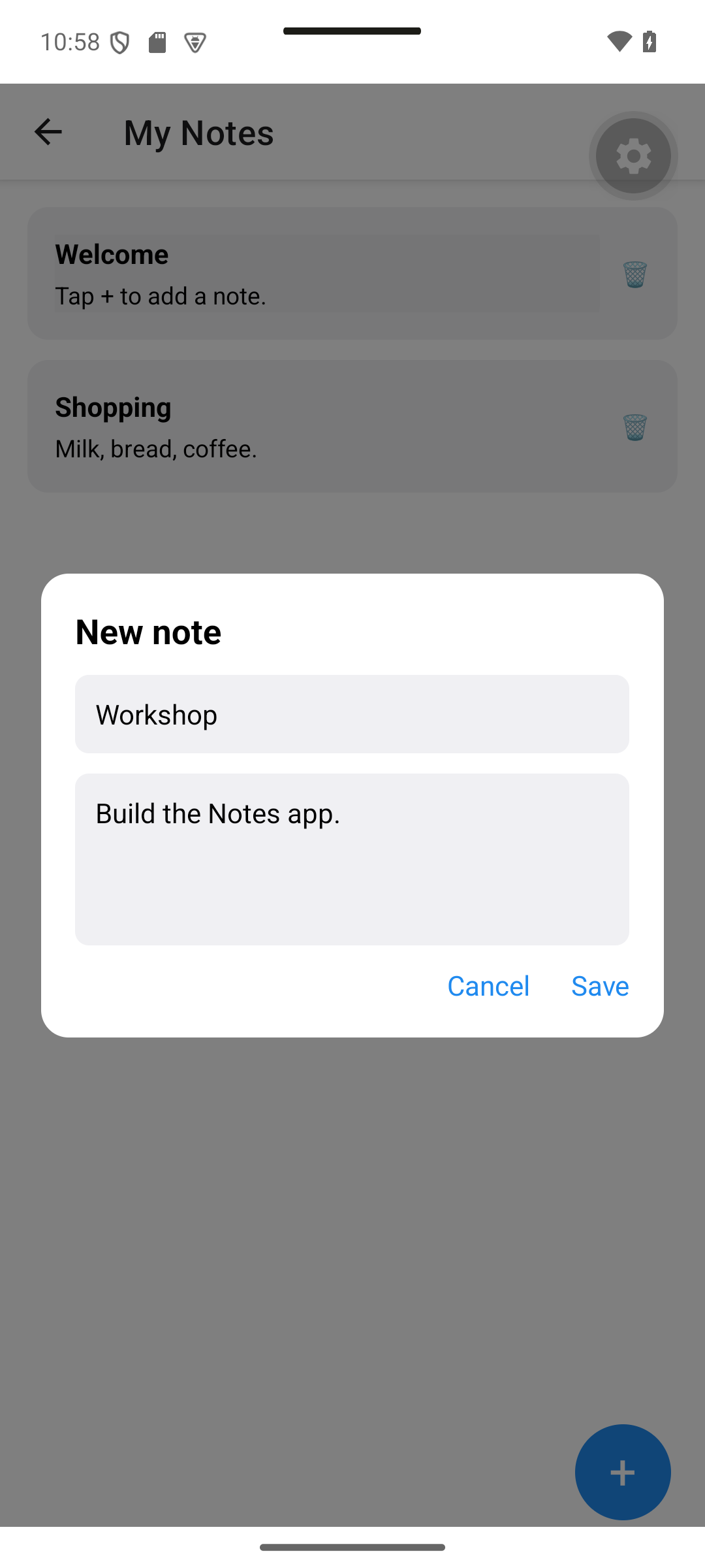
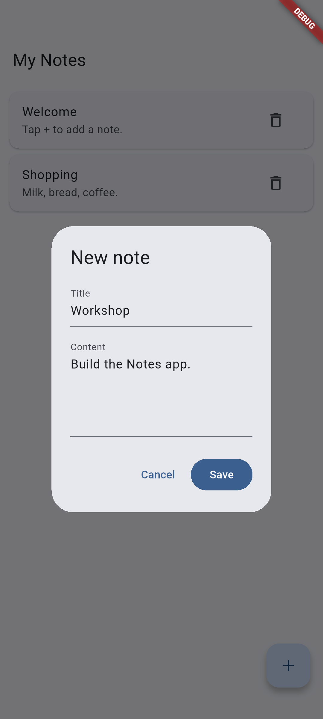
Enter a title and content, then save the new note.
| React Native · Android | Flutter · Android |
|---|---|
|
|
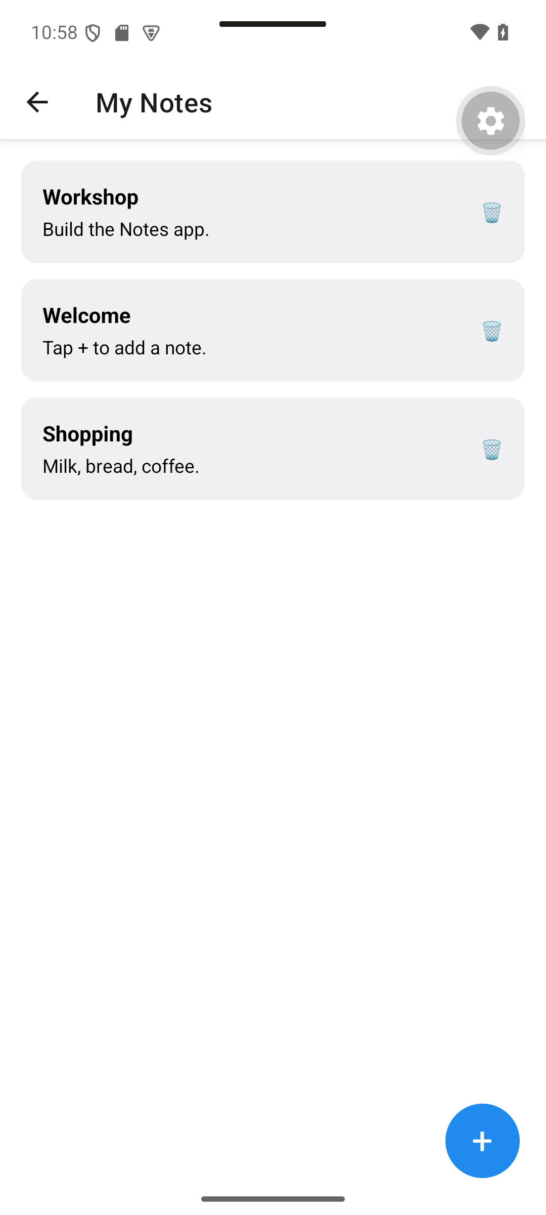
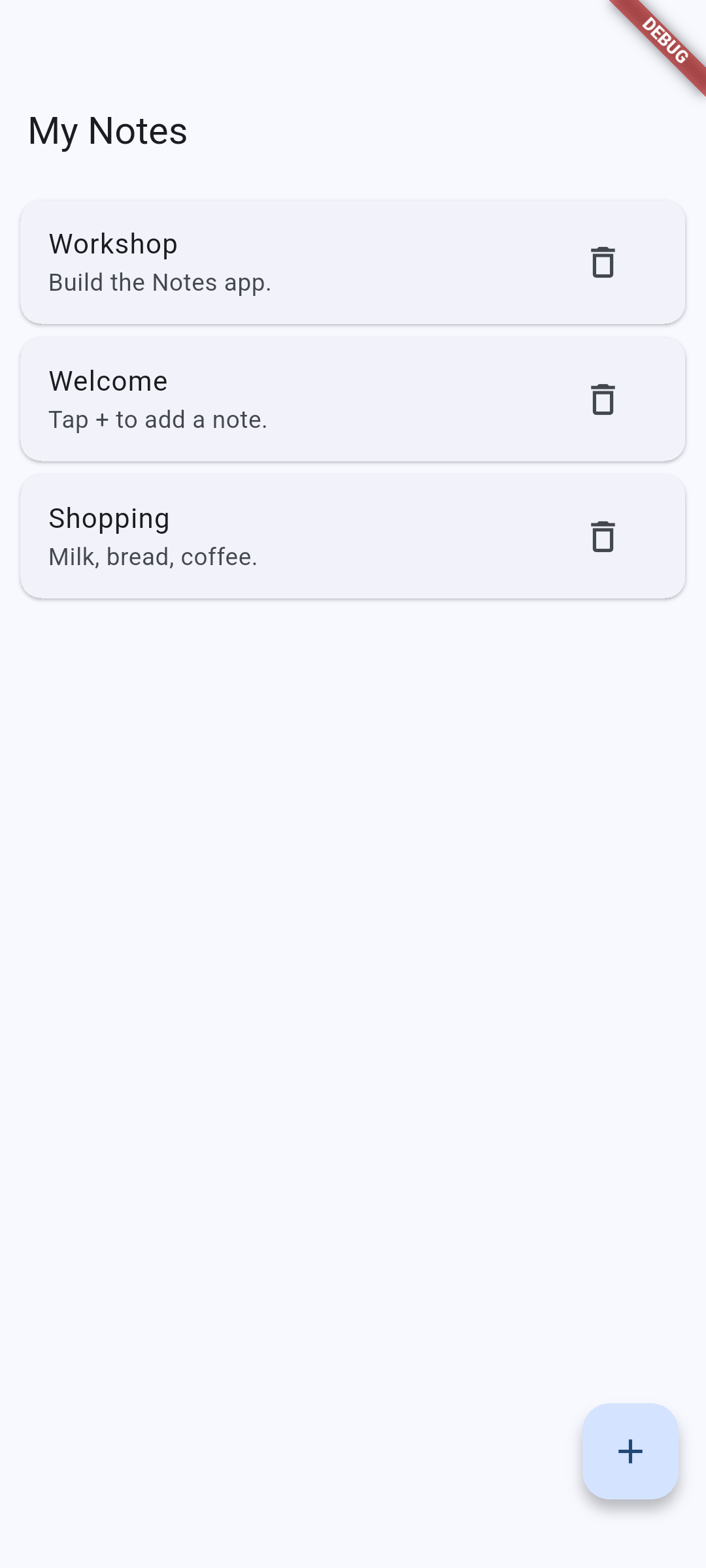
Workshop appears after saving. Tap a note to edit it; the trash action removes it.
| React Native · Android | Flutter · Android |
|---|---|
|
|
Additional real captures: React Native edit, Flutter edit, React Native empty list, Flutter empty list.
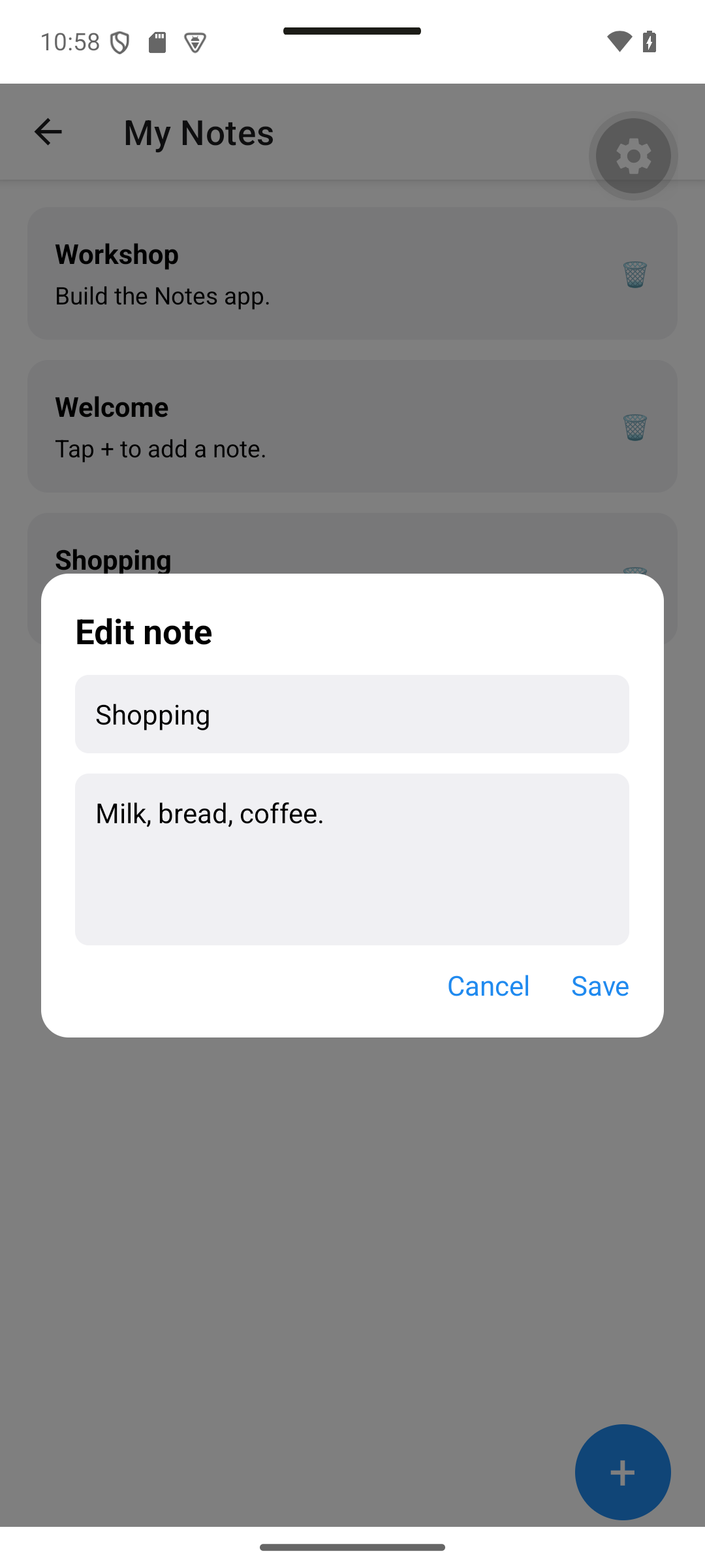
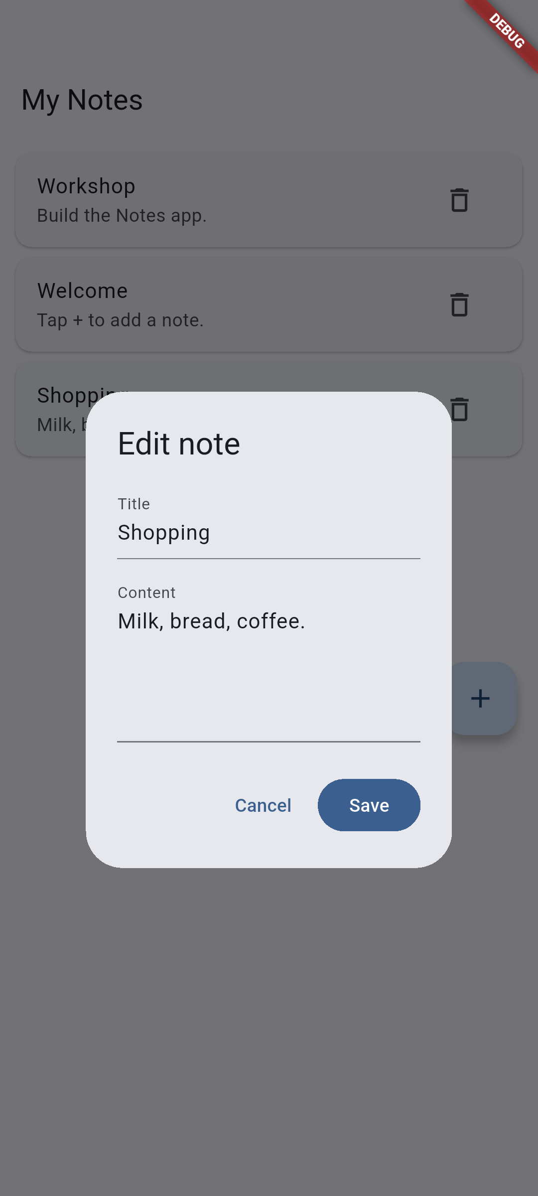
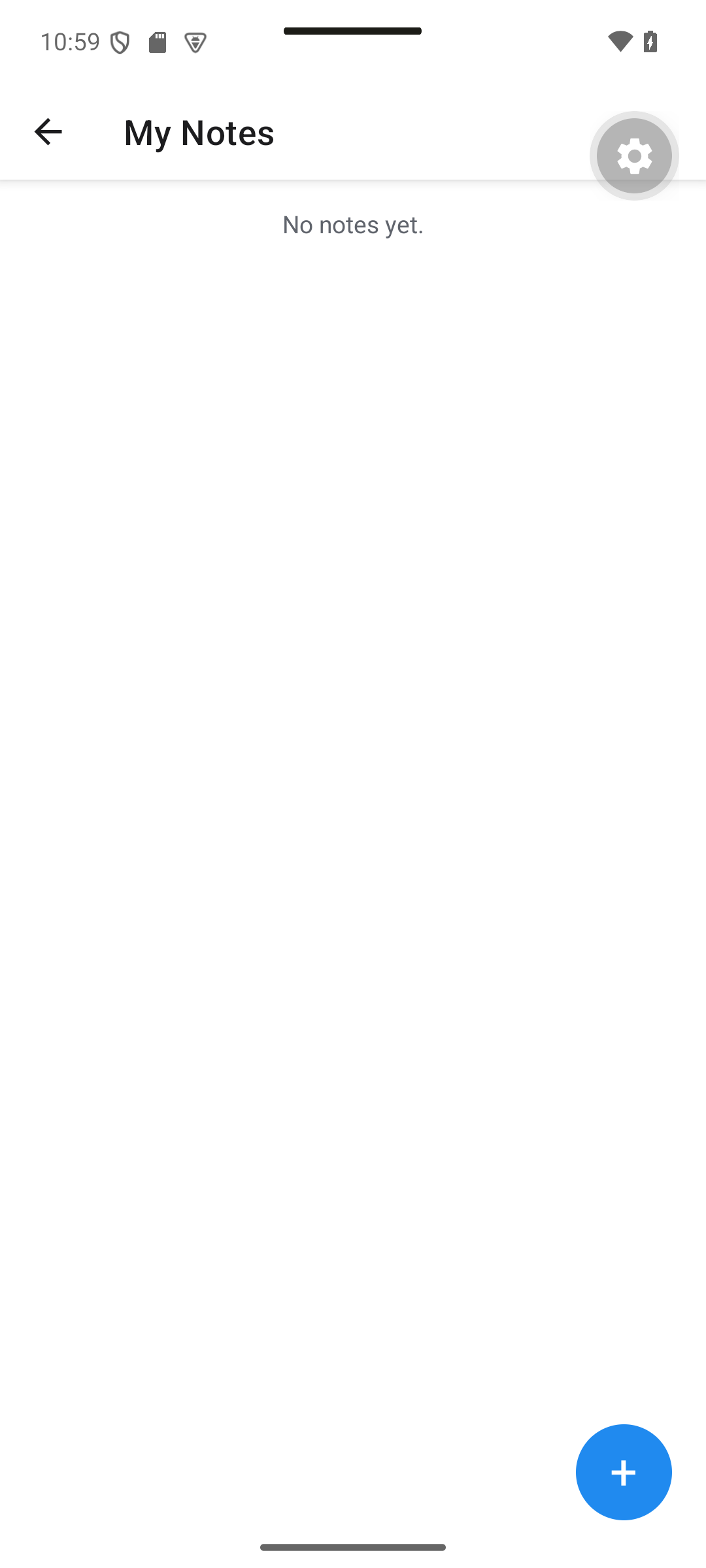
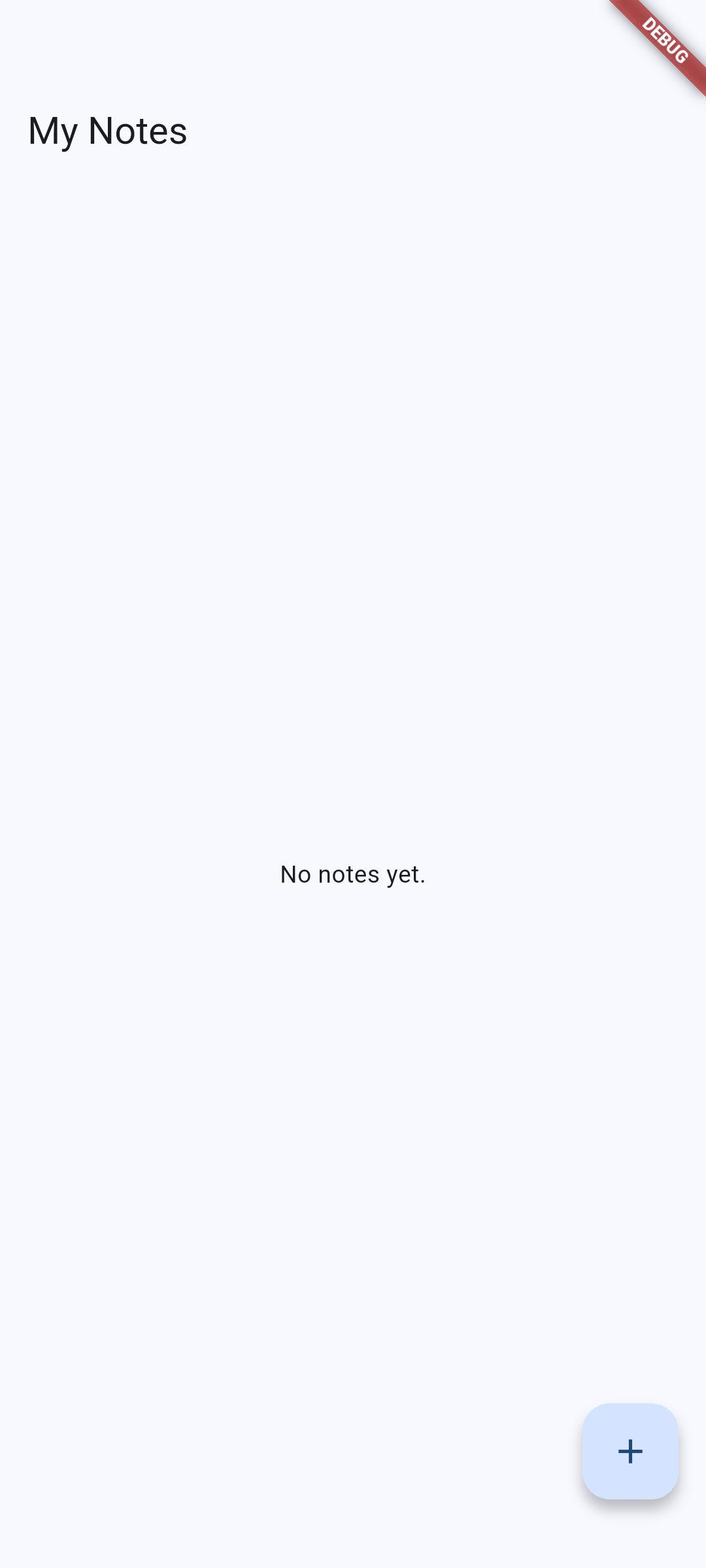
Visual guide. Follow one action through the state update, then check how ids survive list changes.
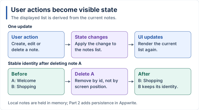
The list is local in Part 1; an id identifies a note independently of its position.
Visual guide. Compare the create and edit paths; cancellation must leave the list unchanged.
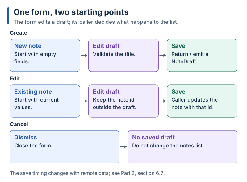
Conceptual form flow: the explicit NoteDraft contract is introduced by the refactoring in section 5.4.
Notes are described by a small data type, then the screen keeps an array of notes in its state.
React Native Notes Screen
// src/types.ts
export type Note = {
  id: string;
  title: string;
  content: string;
};
// src/app/notes.tsx
import { useState } from 'react';
import { Alert, FlatList, Modal, Pressable, StyleSheet, Text, TextInput, View } from 'react-native';
import type { Note } from '../types';
export default function NotesScreen() {
const [notes, setNotes] = useState<Note[]>([
{ id: '1', title: 'Welcome', content: 'Tap + to add a note.' },
{ id: '2', title: 'Shopping', content: 'Milk, bread, coffee.' },
]);
const [modalVisible, setModalVisible] = useState(false);
const [editingId, setEditingId] = useState<string | null>(null);
const [title, setTitle] = useState('');
const [content, setContent] = useState('');
const openNew = () => {
setEditingId(null);
setTitle('');
setContent('');
setModalVisible(true);
};
const openEdit = (note: Note) => {
setEditingId(note.id);
setTitle(note.title);
setContent(note.content);
setModalVisible(true);
};
const save = () => {
if (!title.trim()) {
Alert.alert('Title required', 'Please enter a title.');
return;
}
if (editingId) {
// Never mutate state: create a new array
setNotes(notes.map((n) => (n.id === editingId ? { ...n, title, content } : n)));
} else {
setNotes([{ id: Date.now().toString(), title, content }, ...notes]);
}
setModalVisible(false);
};
const remove = (id: string) => setNotes(notes.filter((n) => n.id !== id));
return (
<View style={styles.container}>
<FlatList
data={notes}
keyExtractor={(note) => note.id}
contentContainerStyle={styles.list}
ListEmptyComponent={<Text style={styles.empty}>No notes yet.</Text>}
renderItem={({ item }) => (
<View style={styles.card}>
<Pressable style={styles.cardBody} onPress={() => openEdit(item)}>
<Text style={styles.cardTitle}>{item.title}</Text>
<Text numberOfLines={2}>{item.content}</Text>
</Pressable>
<Pressable onPress={() => remove(item.id)} hitSlop={8}>
<Text>🗑️</Text>
</Pressable>
</View>
)}
/>
<Pressable style={styles.fab} onPress={openNew}>
<Text style={styles.fabText}>+</Text>
</Pressable>
<Modal visible={modalVisible} transparent animationType="fade" onRequestClose={() => setModalVisible(false)}>
<View style={styles.backdrop}>
<View style={styles.dialog}>
<Text style={styles.dialogTitle}>{editingId ? 'Edit note' : 'New note'}</Text>
<TextInput style={styles.input} placeholder="Title" value={title} onChangeText={setTitle} />
<TextInput
style={[styles.input, styles.multiline]}
placeholder="Content"
value={content}
onChangeText={setContent}
multiline
/>
<View style={styles.actions}>
<Pressable onPress={() => setModalVisible(false)}>
<Text style={styles.action}>Cancel</Text>
</Pressable>
<Pressable onPress={save}>
<Text style={styles.action}>Save</Text>
</Pressable>
</View>
</View>
</View>
</Modal>
</View>
);
}
const styles = StyleSheet.create({
container: { flex: 1, backgroundColor: '#fff' },
list: { padding: 16, gap: 12 },
empty: { textAlign: 'center', color: '#60646c' },
card: {
flexDirection: 'row',
alignItems: 'center',
padding: 16,
borderRadius: 12,
gap: 12,
backgroundColor: '#f0f0f3',
},
cardBody: { flex: 1, gap: 4 },
cardTitle: { fontSize: 16, fontWeight: 'bold' },
fab: {
position: 'absolute',
right: 20,
bottom: 28,
width: 56,
height: 56,
borderRadius: 28,
backgroundColor: '#208AEF',
alignItems: 'center',
justifyContent: 'center',
},
fabText: { color: '#fff', fontSize: 28, lineHeight: 32 },
backdrop: { flex: 1, backgroundColor: 'rgba(0,0,0,0.5)', justifyContent: 'center', padding: 24 },
dialog: { backgroundColor: '#fff', borderRadius: 16, padding: 20, gap: 12 },
dialogTitle: { fontSize: 20, fontWeight: 'bold' },
input: { backgroundColor: '#f0f0f3', borderRadius: 8, padding: 12, fontSize: 16 },
multiline: { minHeight: 100, textAlignVertical: 'top' },
actions: { flexDirection: 'row', justifyContent: 'flex-end', gap: 24 },
action: { color: '#208AEF', fontSize: 16 },
});Explanation:
useState<Note[]>keeps the list in the component state; calling the setter triggers a re-render- State is immutable in React: we create a new array with
map,filteror the spread operator, instead of usingpushor modifying an item FlatListrenders only the rows that are visible.keyExtractorgives each row a stable key so React can update only what changedListEmptyComponentis displayed whendatais emptyModaldisplays the form above the screen;editingIdtells whether we are creating (null) or editing a noteAlert.alertshows a native alert for validation errors- This screen works but is long: we will split it in section 5.4
Flutter Notes Screen
// lib/models/note.dart
/// Immutable data class: to change a note, create a copy.
class Note {
  const Note({required this.id, required this.title, required this.content});

  final String id;
  final String title;
  final String content;

  Note copyWith({String? title, String? content}) =>
      Note(id: id, title: title ?? this.title, content: content ?? this.content);
}
// lib/screens/notes_screen.dart
import 'package:flutter/material.dart';
import '../models/note.dart';
class NotesScreen extends StatefulWidget {
const NotesScreen({super.key});
@override
State<NotesScreen> createState() => _NotesScreenState();
}
class _NotesScreenState extends State<NotesScreen> {
final List<Note> _notes = [
const Note(id: '1', title: 'Welcome', content: 'Tap + to add a note.'),
const Note(id: '2', title: 'Shopping', content: 'Milk, bread, coffee.'),
];
Future<void> _showNoteDialog({Note? note}) async {
final titleController = TextEditingController(text: note?.title);
final contentController = TextEditingController(text: note?.content);
final saved = await showDialog<bool>(
context: context,
builder: (context) => AlertDialog(
title: Text(note == null ? 'New note' : 'Edit note'),
content: Column(
mainAxisSize: MainAxisSize.min,
spacing: 12,
children: [
TextField(
controller: titleController,
decoration: const InputDecoration(labelText: 'Title'),
),
TextField(
controller: contentController,
decoration: const InputDecoration(labelText: 'Content'),
maxLines: 4,
),
],
),
actions: [
TextButton(
onPressed: () => Navigator.pop(context, false),
child: const Text('Cancel'),
),
FilledButton(
onPressed: () => Navigator.pop(context, true),
child: const Text('Save'),
),
],
),
);
final title = titleController.text.trim();
final content = contentController.text.trim();
// NOTE: these controllers are never disposed here. Disposing them right
// after the dialog closes would crash, because the closing animation still
// uses them. We fix this properly in section 5.4.
if (saved != true || title.isEmpty) return;
setState(() {
if (note == null) {
_notes.insert(
0,
Note(id: DateTime.now().microsecondsSinceEpoch.toString(), title: title, content: content),
);
} else {
final index = _notes.indexWhere((n) => n.id == note.id);
_notes[index] = note.copyWith(title: title, content: content);
}
});
}
void _deleteNote(String id) {
setState(() => _notes.removeWhere((n) => n.id == id));
}
@override
Widget build(BuildContext context) {
return Scaffold(
appBar: AppBar(title: const Text('My Notes')),
body: _notes.isEmpty
? const Center(child: Text('No notes yet.'))
: ListView.builder(
padding: const EdgeInsets.all(8),
itemCount: _notes.length,
itemBuilder: (context, index) {
final note = _notes[index];
return Card(
key: ValueKey(note.id),
child: ListTile(
title: Text(note.title),
subtitle: Text(note.content, maxLines: 2, overflow: TextOverflow.ellipsis),
onTap: () => _showNoteDialog(note: note),
trailing: IconButton(
tooltip: 'Delete ${note.title}',
icon: const Icon(Icons.delete_outline),
onPressed: () => _deleteNote(note.id),
),
),
);
},
),
floatingActionButton: FloatingActionButton(
onPressed: () => _showNoteDialog(),
tooltip: 'Add note',
child: const Icon(Icons.add),
),
);
}
}Explanation:
- A screen with changing data is a
StatefulWidget: the widget is immutable, the mutable data lives in itsStateclass setState(() {...})tells Flutter that the data changed and the UI must be rebuiltListView.builderbuilds the rows lazily, only the ones that are visibleValueKeyplays the same role askeyExtractorin React NativeshowDialog<bool>returns aFuture:awaitpauses the function until the user closes the dialog and gives us its resultTextEditingControllerobjects hold resources and should be disposed: this first version leaks them, which is one more reason to refactor (section 5.4)- The data class is immutable (
finalfields +copyWith), which matches the immutable-state idea of React
5.4 Component Refactoring
Expected result. The extracted components keep the same visible result as section 5.3. The captures use this refactored version. Verify that creating, editing, cancelling and deleting still work; restarting the local app restores its initial sample notes.
Concepts in this section:
- Single responsibility: one component/widget, one job
- Props and callbacks (React) vs. constructor parameters and callbacks (Flutter): data flows down, events flow up
- Reusable dialog that returns a result instead of knowing about the list
Visual guide. Read solid arrows downward for data and dashed arrows upward for user intent.
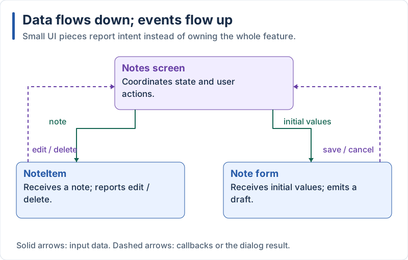
The screen coordinates reusable pieces through input values and callbacks or dialog results.
React Native Component Refactoring
Extract the card into NoteItem:
// src/components/NoteItem.tsx
import { Pressable, StyleSheet, Text, View } from 'react-native';

import type { Note } from '../types';

type Props = {
  note: Note;
  onEdit: (note: Note) => void;
  onDelete: (id: string) => void;
};

export function NoteItem({ note, onEdit, onDelete }: Props) {
  return (
    <View style={styles.card}>
      <Pressable style={styles.body} onPress={() => onEdit(note)} accessibilityRole="button">
        <Text style={styles.title}>{note.title}</Text>
        <Text numberOfLines={2}>{note.content}</Text>
      </Pressable>
      <Pressable
        onPress={() => onDelete(note.id)}
        accessibilityRole="button"
        accessibilityLabel={`Delete ${note.title}`}
        hitSlop={8}>
        <Text>🗑️</Text>
      </Pressable>
    </View>
  );
}

const styles = StyleSheet.create({
  card: {
    flexDirection: 'row',
    alignItems: 'center',
    padding: 16,
    borderRadius: 12,
    gap: 12,
    backgroundColor: '#f0f0f3',
  },
  body: { flex: 1, gap: 4 },
  title: { fontSize: 16, fontWeight: 'bold' },
});
Extract the form into NoteInputModal:
// src/components/NoteInputModal.tsx
import { useState } from 'react';
import { Modal, Pressable, StyleSheet, Text, TextInput, View } from 'react-native';

import type { Note } from '../types';

export type NoteDraft = Pick<Note, 'title' | 'content'>;

type Props = {
  visible: boolean;
  initial?: NoteDraft; // undefined = creating a new note
  onSave: (draft: NoteDraft) => void;
  onCancel: () => void;
};

export function NoteInputModal({ visible, initial, onSave, onCancel }: Props) {
  return (
    <Modal visible={visible} transparent animationType="fade" onRequestClose={onCancel}>
      {/* A different key re-creates the form, which resets its fields */}
      <Form key={initial ? initial.title + initial.content : 'new'} initial={initial} onSave={onSave} onCancel={onCancel} />
    </Modal>
  );
}

function Form({ initial, onSave, onCancel }: Omit<Props, 'visible'>) {
  const [title, setTitle] = useState(initial?.title ?? '');
  const [content, setContent] = useState(initial?.content ?? '');
  const canSave = title.trim().length > 0;

  return (
    <View style={styles.backdrop}>
      <View style={styles.dialog}>
        <Text style={styles.heading}>{initial ? 'Edit note' : 'New note'}</Text>
        <TextInput style={styles.input} placeholder="Title" value={title} onChangeText={setTitle} />
        <TextInput
          style={[styles.input, styles.multiline]}
          placeholder="Content"
          value={content}
          onChangeText={setContent}
          multiline
        />
        <View style={styles.actions}>
          <Pressable onPress={onCancel}>
            <Text style={styles.action}>Cancel</Text>
          </Pressable>
          <Pressable
            disabled={!canSave}
            onPress={() => onSave({ title: title.trim(), content: content.trim() })}
            style={{ opacity: canSave ? 1 : 0.4 }}>
            <Text style={styles.action}>Save</Text>
          </Pressable>
        </View>
      </View>
    </View>
  );
}

const styles = StyleSheet.create({
  backdrop: { flex: 1, backgroundColor: 'rgba(0,0,0,0.5)', justifyContent: 'center', padding: 24 },
  dialog: { backgroundColor: '#fff', borderRadius: 16, padding: 20, gap: 12 },
  heading: { fontSize: 20, fontWeight: 'bold' },
  input: { backgroundColor: '#f0f0f3', borderRadius: 8, padding: 12, fontSize: 16 },
  multiline: { minHeight: 100, textAlignVertical: 'top' },
  actions: { flexDirection: 'row', justifyContent: 'flex-end', gap: 24 },
  action: { color: '#208AEF', fontSize: 16 },
});
The screen becomes much shorter:
// src/app/notes.tsx
import { useState } from 'react';
import { FlatList, Pressable, StyleSheet, Text, View } from 'react-native';

import { NoteInputModal, type NoteDraft } from '../components/NoteInputModal';
import { NoteItem } from '../components/NoteItem';
import type { Note } from '../types';

export default function NotesScreen() {
  const [notes, setNotes] = useState<Note[]>([
    { id: '1', title: 'Welcome', content: 'Tap + to add a note.' },
    { id: '2', title: 'Shopping', content: 'Milk, bread, coffee.' },
  ]);
  // null = dialog closed, 'new' = creating, a Note = editing it
  const [editing, setEditing] = useState<Note | 'new' | null>(null);

  const save = (draft: NoteDraft) => {
    if (editing === 'new') {
      setNotes([{ id: Date.now().toString(), ...draft }, ...notes]);
    } else if (editing) {
      setNotes(notes.map((n) => (n.id === editing.id ? { ...n, ...draft } : n)));
    }
    setEditing(null);
  };

  return (
    <View style={styles.container}>
      <FlatList
        data={notes}
        keyExtractor={(note) => note.id}
        contentContainerStyle={styles.list}
        ListEmptyComponent={<Text style={styles.empty}>No notes yet.</Text>}
        renderItem={({ item }) => (
          <NoteItem
            note={item}
            onEdit={setEditing}
            onDelete={(id) => setNotes(notes.filter((n) => n.id !== id))}
          />
        )}
      />

      <Pressable
        style={styles.fab}
        onPress={() => setEditing('new')}
        accessibilityRole="button"
        accessibilityLabel="Add note">
        <Text style={styles.fabText}>+</Text>
      </Pressable>

      <NoteInputModal
        visible={editing !== null}
        initial={editing && editing !== 'new' ? editing : undefined}
        onSave={save}
        onCancel={() => setEditing(null)}
      />
    </View>
  );
}

const styles = StyleSheet.create({
  container: { flex: 1, backgroundColor: '#fff' },
  list: { padding: 16, gap: 12 },
  empty: { textAlign: 'center', color: '#60646c' },
  fab: {
    position: 'absolute',
    right: 20,
    bottom: 28,
    width: 56,
    height: 56,
    borderRadius: 28,
    backgroundColor: '#208AEF',
    alignItems: 'center',
    justifyContent: 'center',
  },
  fabText: { color: '#fff', fontSize: 28, lineHeight: 32 },
});
Explanation:
NoteItemreceives the note and two callbacks as props: it does not know where the data comes fromNoteInputModalonly edits a draft and callsonSave(draft): the screen decides what to do with it- One
editingstate replaces several booleans/ids and makes impossible states impossible accessibilityRoleandaccessibilityLabelmake the app usable with a screen reader
Flutter Component Refactoring
Extract the card into NoteItem:
// lib/widgets/note_item.dart
import 'package:flutter/material.dart';

import '../models/note.dart';

class NoteItem extends StatelessWidget {
  const NoteItem({
    super.key,
    required this.note,
    required this.onEdit,
    required this.onDelete,
  });

  final Note note;
  final VoidCallback onEdit;
  final VoidCallback onDelete;

  @override
  Widget build(BuildContext context) {
    return Card(
      child: ListTile(
        title: Text(note.title),
        subtitle: Text(note.content, maxLines: 2, overflow: TextOverflow.ellipsis),
        onTap: onEdit,
        trailing: IconButton(
          tooltip: 'Delete ${note.title}',
          icon: const Icon(Icons.delete_outline),
          onPressed: onDelete,
        ),
      ),
    );
  }
}
Add a NoteDraft type to the model file (a Dart record: a lightweight immutable tuple with named fields):
// lib/models/note.dart (add at the end)

/// Title and content typed by the user, before an id is assigned.
typedef NoteDraft = ({String title, String content});
Extract the dialog. It is a function that returns the result of the dialog:
// lib/widgets/note_input_dialog.dart
import 'package:flutter/material.dart';

import '../models/note.dart';

/// Shows the dialog and returns the draft, or null if the user cancelled.
Future<NoteDraft?> showNoteInputDialog(BuildContext context, {Note? initial}) {
  return showDialog<NoteDraft>(
    context: context,
    builder: (_) => _NoteInputDialog(initial: initial),
  );
}

class _NoteInputDialog extends StatefulWidget {
  const _NoteInputDialog({this.initial});

  final Note? initial;

  @override
  State<_NoteInputDialog> createState() => _NoteInputDialogState();
}

class _NoteInputDialogState extends State<_NoteInputDialog> {
  late final _title = TextEditingController(text: widget.initial?.title);
  late final _content = TextEditingController(text: widget.initial?.content);

  @override
  void dispose() {
    _title.dispose();
    _content.dispose();
    super.dispose();
  }

  @override
  Widget build(BuildContext context) {
    return AlertDialog(
      title: Text(widget.initial == null ? 'New note' : 'Edit note'),
      content: Column(
        mainAxisSize: MainAxisSize.min,
        spacing: 12,
        children: [
          TextField(
            controller: _title,
            decoration: const InputDecoration(labelText: 'Title'),
            onChanged: (_) => setState(() {}), // re-evaluate the Save button
          ),
          TextField(
            controller: _content,
            decoration: const InputDecoration(labelText: 'Content'),
            maxLines: 4,
          ),
        ],
      ),
      actions: [
        TextButton(
          onPressed: () => Navigator.pop(context),
          child: const Text('Cancel'),
        ),
        FilledButton(
          // null disables the button
          onPressed: _title.text.trim().isEmpty
              ? null
              : () => Navigator.pop(
                    context,
                    (title: _title.text.trim(), content: _content.text.trim()),
                  ),
          child: const Text('Save'),
        ),
      ],
    );
  }
}
The screen becomes:
// lib/screens/notes_screen.dart
import 'package:flutter/material.dart';

import '../models/note.dart';
import '../widgets/note_input_dialog.dart';
import '../widgets/note_item.dart';

class NotesScreen extends StatefulWidget {
  const NotesScreen({super.key});

  @override
  State<NotesScreen> createState() => _NotesScreenState();
}

class _NotesScreenState extends State<NotesScreen> {
  final List<Note> _notes = [
    const Note(id: '1', title: 'Welcome', content: 'Tap + to add a note.'),
    const Note(id: '2', title: 'Shopping', content: 'Milk, bread, coffee.'),
  ];

  Future<void> _add() async {
    final draft = await showNoteInputDialog(context);
    if (draft == null) return;
    setState(() {
      _notes.insert(
        0,
        Note(
          id: DateTime.now().microsecondsSinceEpoch.toString(),
          title: draft.title,
          content: draft.content,
        ),
      );
    });
  }

  Future<void> _edit(Note note) async {
    final draft = await showNoteInputDialog(context, initial: note);
    if (draft == null) return;
    setState(() {
      final index = _notes.indexWhere((n) => n.id == note.id);
      _notes[index] = note.copyWith(title: draft.title, content: draft.content);
    });
  }

  void _delete(String id) => setState(() => _notes.removeWhere((n) => n.id == id));

  @override
  Widget build(BuildContext context) {
    return Scaffold(
      appBar: AppBar(title: const Text('My Notes')),
      body: _notes.isEmpty
          ? const Center(child: Text('No notes yet.'))
          : ListView.builder(
              padding: const EdgeInsets.all(8),
              itemCount: _notes.length,
              itemBuilder: (context, index) {
                final note = _notes[index];
                return NoteItem(
                  key: ValueKey(note.id),
                  note: note,
                  onEdit: () => _edit(note),
                  onDelete: () => _delete(note.id),
                );
              },
            ),
      floatingActionButton: FloatingActionButton(
        onPressed: _add,
        tooltip: 'Add note',
        child: const Icon(Icons.add),
      ),
    );
  }
}
Explanation:
NoteItemis aStatelessWidget: it receives data and callbacks through its constructorVoidCallbackis the type of a function without parameters and without result (() => void)- The dialog widget owns its
TextEditingControllers and disposes them indispose(), so the screen stays clean - The dialog returns a
NoteDraft?:nullmeans “cancelled”, which is easier to handle than a boolean plus separate controllers - The screen only coordinates: show dialog, update the list, rebuild
Good practice: after an
await, if you use theBuildContextagain, checkif (!mounted) return;first (the screen may have been closed meanwhile). In this screen we only callsetStateafter theawait, which is safe because the data is plain values.
React Native vs Flutter Comparison
Expected result. Compare the two actual results in sections 5.2 and 5.3: they implement the same interactions using the native controls and styling of each framework.
Visual guide. Review the rendering overview and the data-flow diagram while comparing the framework names below.
| Concept | React Native (Expo) | Flutter |
|---|---|---|
| Project creation | npx create-expo-app@latest |
flutter create |
| Language | TypeScript | Dart |
| UI building block | Component (function returning JSX) | Widget (class with a build method) |
| Layout | Flexbox (View + style props) |
Row, Column, Expanded, Padding… |
| Styling | StyleSheet.create |
Widget properties and BoxDecoration, themes |
| Long lists | FlatList |
ListView.builder |
| Local state | useState |
StatefulWidget + setState |
| List keys | keyExtractor / key |
ValueKey / key |
| Navigation | Expo Router (files = routes) | go_router (GoRoute list) |
| Modal form | Modal + TextInput |
showDialog + AlertDialog + TextField |
| Passing data down | Props | Constructor parameters |
| Sending events up | Callback props (onSave) |
Callbacks (VoidCallback) or returned values |
In Part 2 we replace the in-memory list with a real database.
By Wahid Hamdi